
Renewed website
Discover all changes!
General
| 19-02-2020
After a few months of experience, I decided it was time for a thorough renewal of this website. The goal: to make the site more beautiful, more user-friendly and more future-proof. Do you want to know what I have changed to achieve that and / or how everything works on this site? Then read on.
The same everywhere: nice and clear
Some parts of my site are now the same on all pages. For example, everything that is clickable has an animation: whether you move your mouse over a button, a title or an image, you can tell by the movement or color change that you can click it. That is, on a desktop computer or laptop. Of course you don't use a mouse on mobile devices such as tablets and smartphones, but luckily there are other ways to make clear which parts of a site are clickable. But I'll come back to that later.
On the right side of the black bar is a new button: 'Lees in het Nederlands'. My site is now also available in English, so there has to be a button to switch the language. Whichever page you are on, click on the 'Lees in het Nederlands' button and you will get the Dutch version of the page you are on. The other way round, you can go to the English equivalent from any page in Dutch by clicking on 'Read in English'. That button is of course in the same place, at the top right of the page.
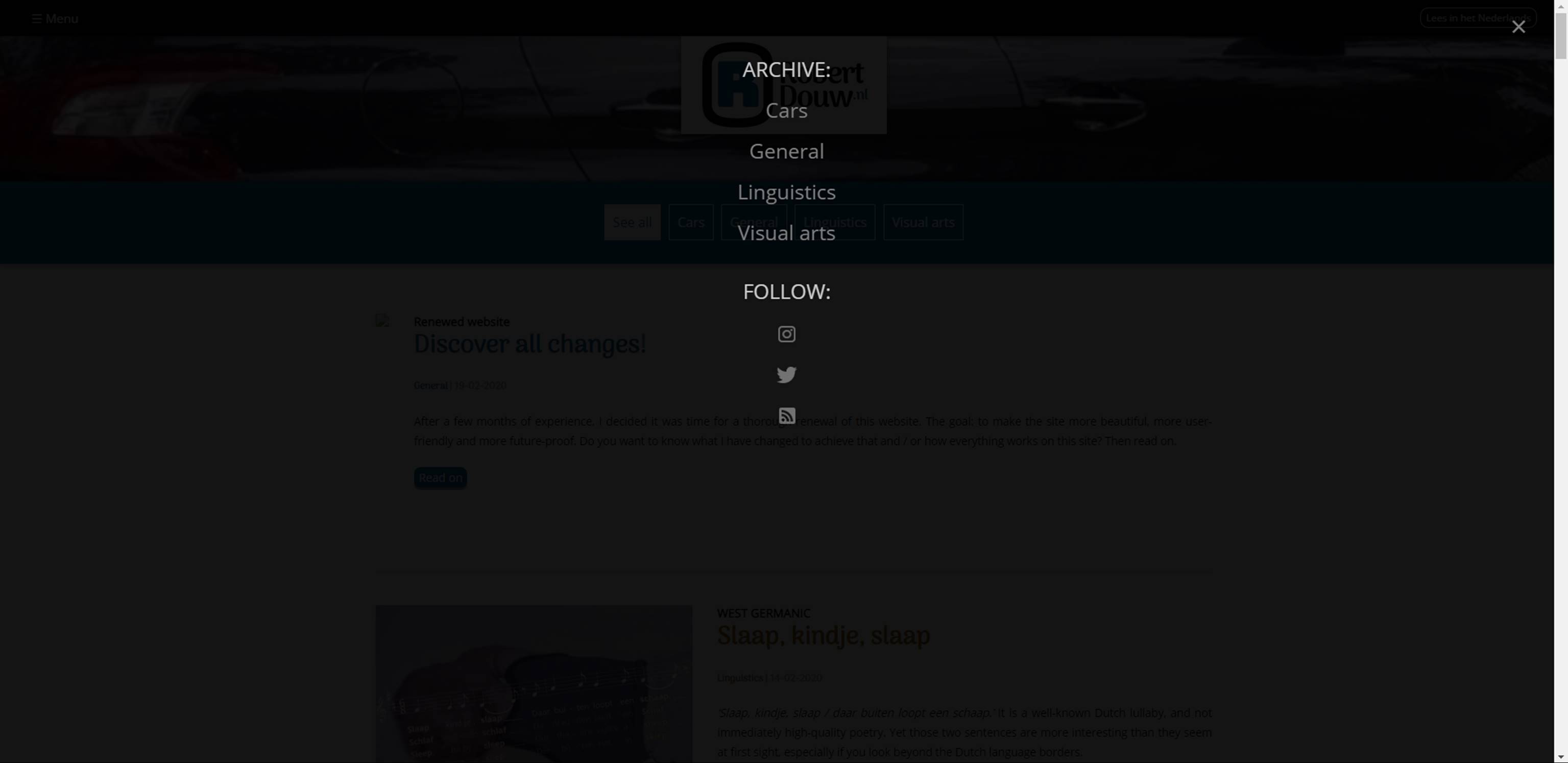
The renewed menu
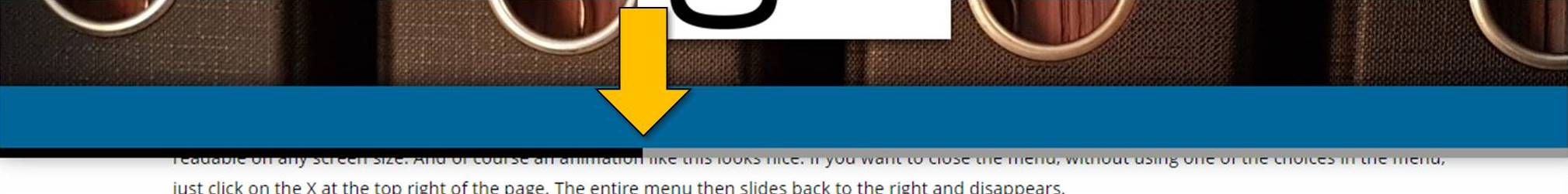
If you click or press the menu button, the menu will slide over your screen from the left. By choosing this design, I was able to make the menu clearly readable on any screen size. And of course an animation like this looks nice. If you want to close the menu, without using one of the choices in the menu, just click on the X at the top right of the page. The entire menu then slides back to the right and disappears.
The menu is divided into two 'sections': archive and follow. Under the first are links to the archive pages. Indeed: plural. Each category now has its own archive page, so you have to scroll less to find what you are looking for. In addition, this creates space to add new sections in the future, if I would like to. Under follow you will find symbols that lead you to social media such as Instagram and Twitter, and other ways to be notified when I add something to my blog, such as an RSS feed. The feed is now available in two versions: a Dutch-language (which is the one I already used before) and a new one in English.
Filters, colour scheme and a moving bar
On my blog I write about various topics, all of which I find interesting. The latter of course doesn't apply to everyone; maybe you only visit this website for the pieces about cars, or maybe you're only interested in what I write about linguistics. If so, you'll be happy with the addition you can find in the blue bar below the logo. From now on, you can find a number of buttons in that spot that help you filter. Click or press on the category of your choice, and all other articles will disappear from the homepage. This way you can browse the page without having to scroll through everything that you're not interested in.

If you went to an article by clicking on an image, title or 'Read more' button on the homepage, you will see another renewal. There are no filter buttons in the blue bar below the logo at the top of the page here - you no longer need them if you have chosen an item. What you do see is a thin grey bar. This will slowly turn black if you scroll down. This way, while reading, you can see exactly how much of the article you have read already.
With the above I have named the most important changes. I have changed more, quite a bit even, but it is going too far to mention all of it. The invisible changes matter mainly to me. You can discover the visible changes, such as the dimensions of the images and the size of the letters, yourself. And if they do not stand out, I find it all the better: then everything is probably right as it is.
The same everywhere: nice and clear
Some parts of my site are now the same on all pages. For example, everything that is clickable has an animation: whether you move your mouse over a button, a title or an image, you can tell by the movement or color change that you can click it. That is, on a desktop computer or laptop. Of course you don't use a mouse on mobile devices such as tablets and smartphones, but luckily there are other ways to make clear which parts of a site are clickable. But I'll come back to that later.
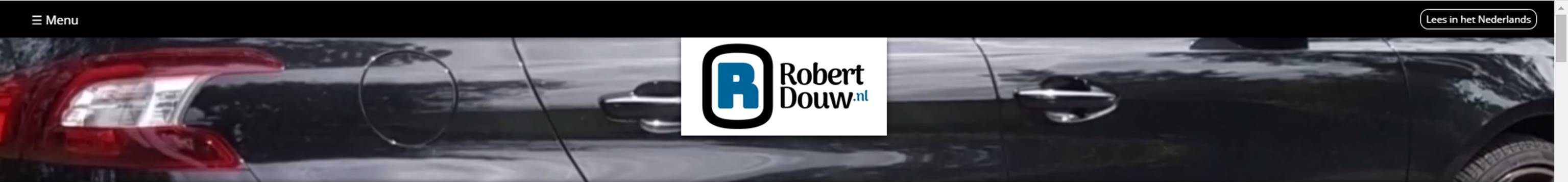
The head of the page
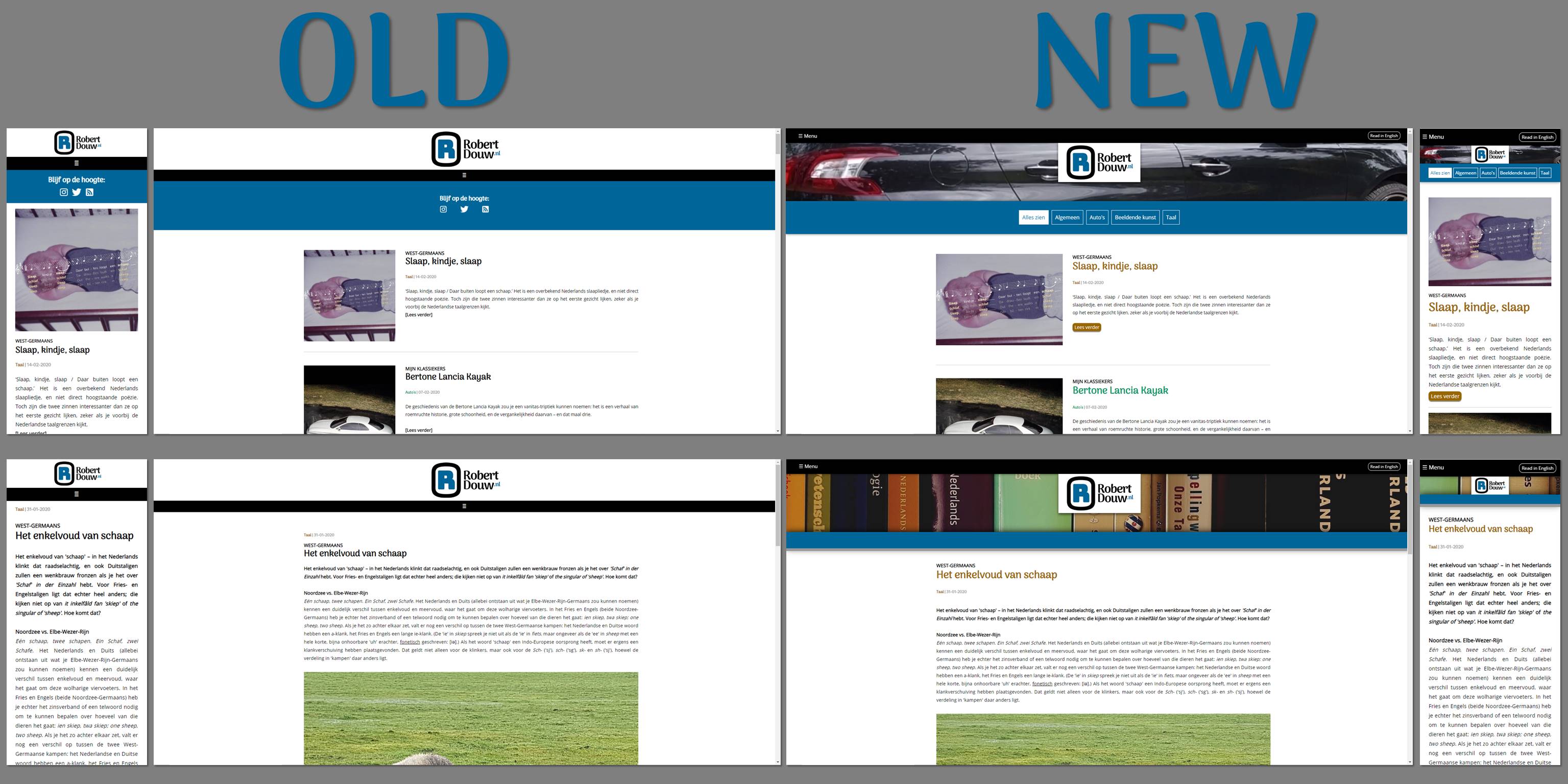
Another thing that is the same on every page, is the head of the page. On this site, this is always the black bar at the top of the page and the bar with an image and the logo below it. In the black bar, you'll find the menu button on the left. In addition to the well-known 'hamburger' (≡), I have now also added the word 'Menu'. That makes the site more user-friendly, especially for people who use reading software.On the right side of the black bar is a new button: 'Lees in het Nederlands'. My site is now also available in English, so there has to be a button to switch the language. Whichever page you are on, click on the 'Lees in het Nederlands' button and you will get the Dutch version of the page you are on. The other way round, you can go to the English equivalent from any page in Dutch by clicking on 'Read in English'. That button is of course in the same place, at the top right of the page.
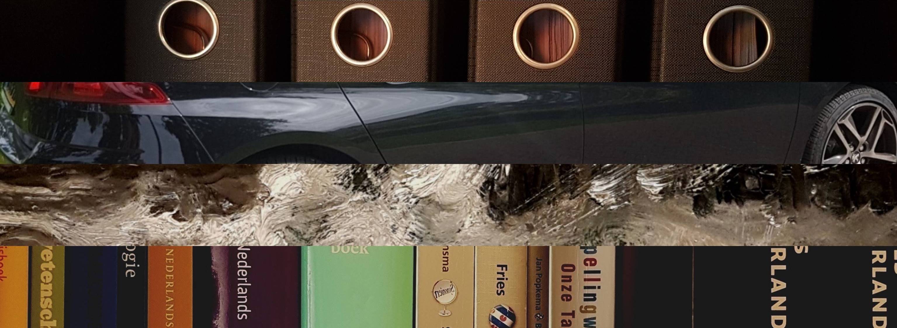
Each category has its own image
Under the black bar there is one with a picture or, on the homepage, a video. In the video there are several images that give an indication of the categories on the website. Above each article there is an image in the bar that helps you recognize the category the page belongs to. The logo is placed over the image or the video. If you click on or press the logo on any page, you will return to the homepage. The head of the page always remains on screen, so you can open the menu at any time or return to the homepage from another page.The renewed menu
If you click or press the menu button, the menu will slide over your screen from the left. By choosing this design, I was able to make the menu clearly readable on any screen size. And of course an animation like this looks nice. If you want to close the menu, without using one of the choices in the menu, just click on the X at the top right of the page. The entire menu then slides back to the right and disappears.
The renewed menu
In the new menu there is more to be found than before. By putting more information in one place, it all becomes easier to find. Moreover, it saves buttons on the page, making the whole clearer and cleaner, which is easier on the eye. I'll spare you the technical details, but for me it has the added advantage that I have to perform fewer actions if I want to adjust some part of the website or add anything to the menu.The menu is divided into two 'sections': archive and follow. Under the first are links to the archive pages. Indeed: plural. Each category now has its own archive page, so you have to scroll less to find what you are looking for. In addition, this creates space to add new sections in the future, if I would like to. Under follow you will find symbols that lead you to social media such as Instagram and Twitter, and other ways to be notified when I add something to my blog, such as an RSS feed. The feed is now available in two versions: a Dutch-language (which is the one I already used before) and a new one in English.
Filters, colour scheme and a moving bar
On my blog I write about various topics, all of which I find interesting. The latter of course doesn't apply to everyone; maybe you only visit this website for the pieces about cars, or maybe you're only interested in what I write about linguistics. If so, you'll be happy with the addition you can find in the blue bar below the logo. From now on, you can find a number of buttons in that spot that help you filter. Click or press on the category of your choice, and all other articles will disappear from the homepage. This way you can browse the page without having to scroll through everything that you're not interested in.
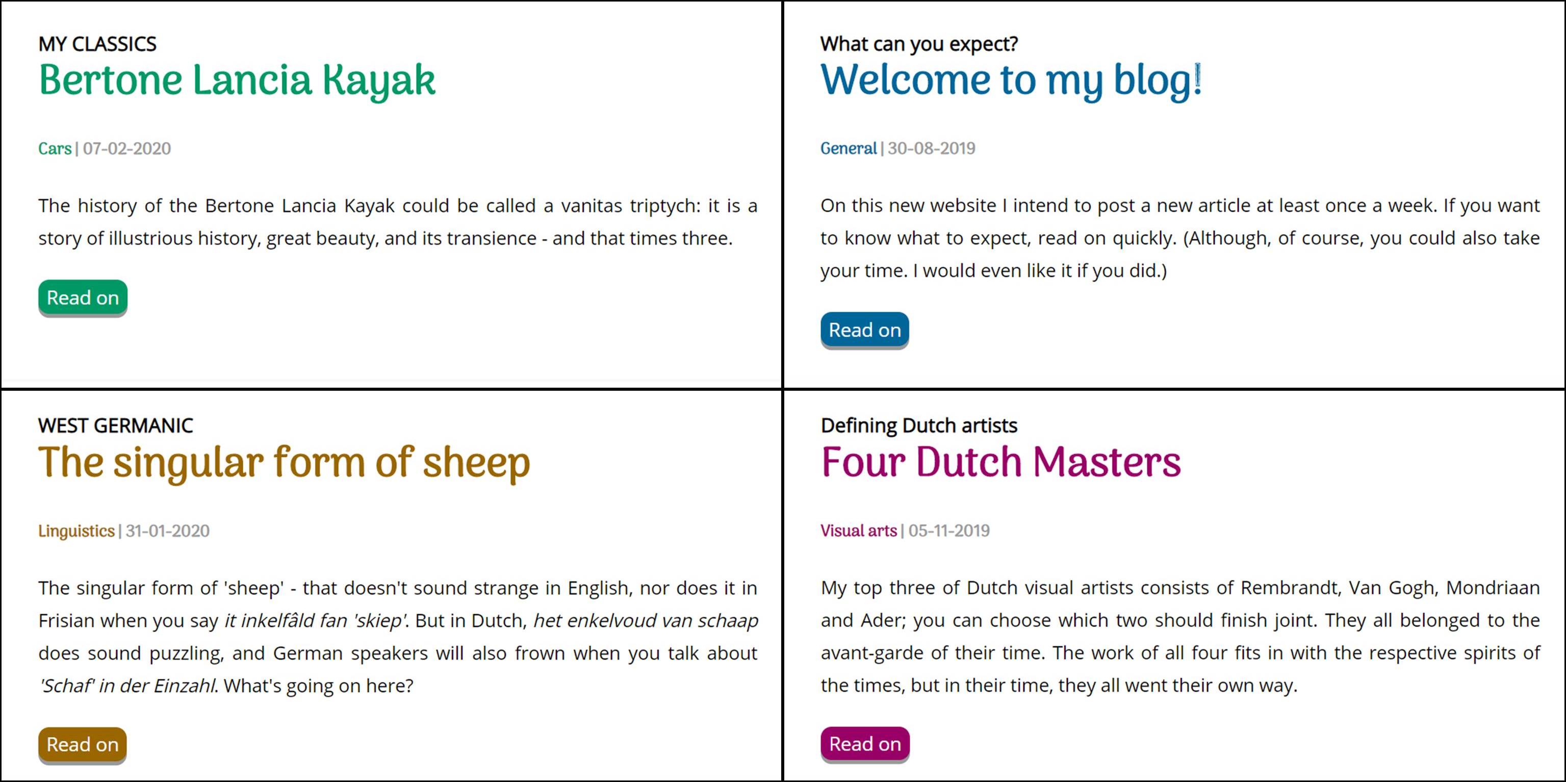
Filter the homepage by category
Another way to make navigation on the home page easier is the use of a colour scheme. The coloured text you see doesn't only have the function of making the site less boring, it also works as a signal colour. I already used these colours on the previous version of the site, but only for the word that indicates the category. Now the title of the article and the 'Read more' button are in the colour of the category as well. So if you want to read about cars, you should look for the green text. On the image below you can see all the colours I currently use.
Each category has its own color
The colours not only ensure faster recognition of the category. On mobile devices they also make clear which components can be clicked on the homepage. In addition, the titles stand out more, which also contributes to finding what you are looking for faster.If you went to an article by clicking on an image, title or 'Read more' button on the homepage, you will see another renewal. There are no filter buttons in the blue bar below the logo at the top of the page here - you no longer need them if you have chosen an item. What you do see is a thin grey bar. This will slowly turn black if you scroll down. This way, while reading, you can see exactly how much of the article you have read already.
The 'scroll indicator' above each item
More visible and invisible changesWith the above I have named the most important changes. I have changed more, quite a bit even, but it is going too far to mention all of it. The invisible changes matter mainly to me. You can discover the visible changes, such as the dimensions of the images and the size of the letters, yourself. And if they do not stand out, I find it all the better: then everything is probably right as it is.