
ART PIECES
Mark Rothko: Untitled (Seagram Mural sketch)
Visual arts
| 18-09-2020
What causes that a work of art affects you, moves you? That question is difficult to answer anyway, but the more abstract the work of art, the more difficult it becomes: after all, without a recognizable representation, not much is left than colour and composition. Or is it?
My first introduction to Rothko was in high school, I think in the last two years of my Higher General Secondary Eduction. I took the drawing class and as part of that we also got art history. If I remember correctly, we watched a film clip in which Rothko (or was it the voice-over?) told how he saw not the bright colours, but rather the dark tones as 'cheerful'. Or something like that. That different view of reality intrigued me so much that I still remember it now, some twenty years later. And yet for a long time I didn't really feel any connection to Rothko's paintings, or at least I never really studied his work, not even when a few years later I was on the Fine Art and Design teacher training.
colour areas and blah-blah
Although the process of abstracting appealed to me quite early on, honesty compels me to admit that I've once been somewhat skeptical about abstract art, as the work of people who weren't good enough in figurative art and therefore started painting patches of colour, followed by a lot of stilted blah-blah to justify it as art. For some 'artists' that may be true. I now know that this doesn't apply to big names like Mondrian and Rothko, let's say the first and second generation of abstract artists. Mondrian was perfectly capable of creating high-quality figurative works, but while searching for a higher form of art, came up with his abstract compositions. For him that ended with the Victory Boogie Woogie, but if he had lived longer, that development would probably have continued. Perhaps in the direction of the work Rothko made over time.
Search further
The visual arts career of Mark Rothko (1903-1970) also started with figurative art, although it was already somewhat stylized and somewhat primitive in nature, if I may call it that. The first paintings with diffuse areas of colour had several small areas of bright colours such as yellow, red and blue. You could call them 'diffuse Mondrians' (I'm not the first to call them that, I mean it positively), and I wouldn't be surprised if Rothko saw his work in a sense as a continuation of that quest for art that does more than represent visible reality. As far as I am concerned, a good figurative painting should do that too, but Rothko sought it in working with increasingly larger areas of colour, built up in transparent layers and in a large format, so that you would, as it were, get sucked into the painting. The fact that Rothko's career was a quest is also evident from the fact that after the paintings with red and brown tones, such as Untitled (Seagram Mural sketch), he again used brighter colours for a while, and finished his career with a alternating bright and dark coloured works.
In 2014-2015, the Gemeentemuseum organized the first retrospective exhibition of Rothko's work in the Netherlands since 1972. I was born in 1983, so this was a first and unique opportunity for me that I had to seize, of course. By then I understood the idea of the large, low-hanging, layered canvases and was ready to be overwhelmed. But painting after painting nothing happened; it didn't move me, didn't hit me – until I got to Untitled (Seagram Mural sketch). Suddenly I did feel the emotion that Rothko had put into it, in my perception. A sad and at the same time oppressive feeling. The feeling of being taken by my throat by the painting. I would have preferred to have forgotten the world around me and to have been alone with the painting for a while, but there were too many people in the museum room for that.
Ominous gate
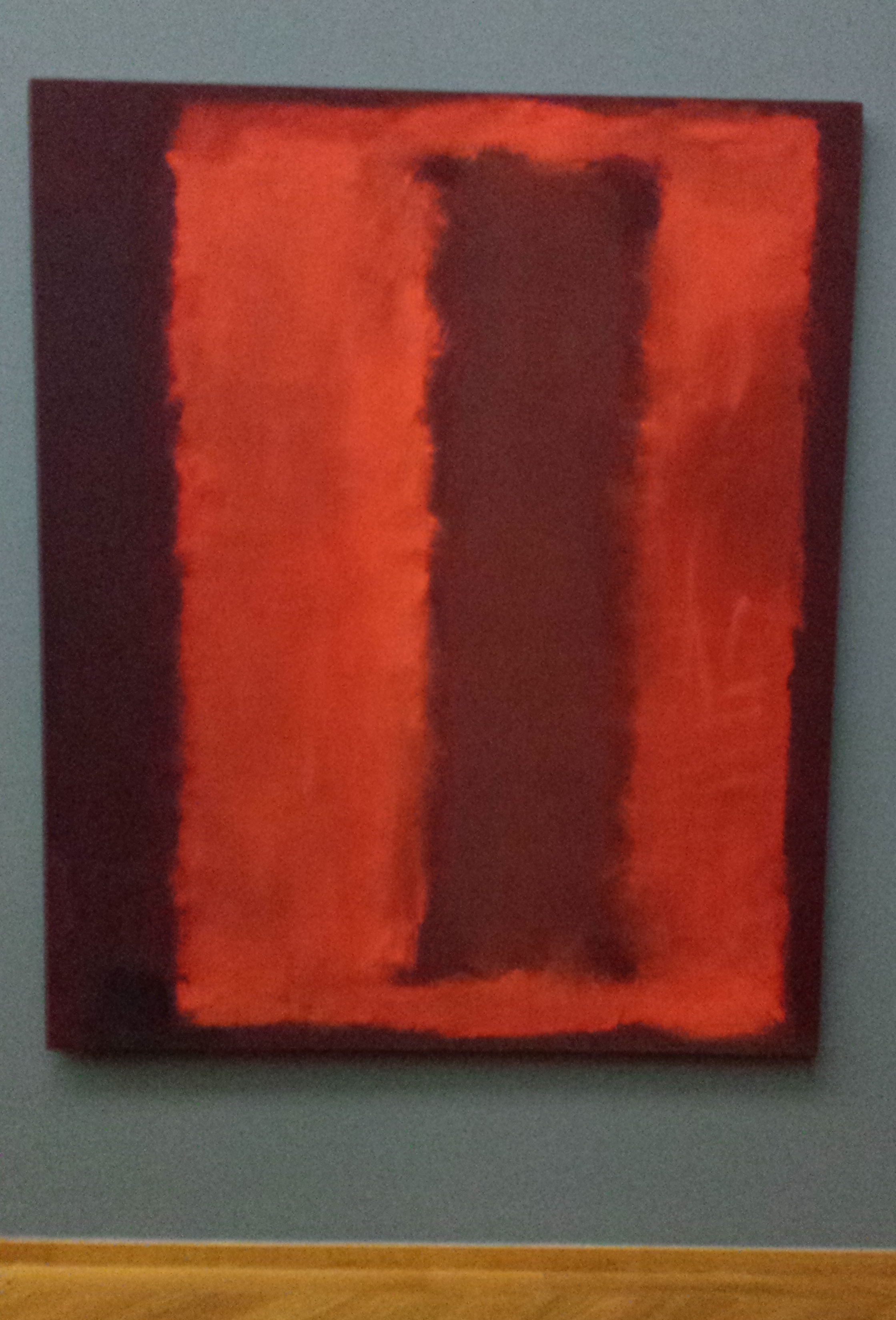
Perhaps I should have left it with that feeling I can barely put into words – some things just can be expressed better in images or music – but involuntarily I began to wonder what this canvas had that the other works did not have. Was it the use of colour? I think that plays a role, because the reddish-brown works from around 1958-1959 appeal to me the most. In 2019 I saw a number of other Seagram works in London, but not all of them have the same effect on me. What does make the 1959 sketch differ from most of the other Rothkos, is the composition: instead of horizontal areas of colour one below the other, this painting has vertical areas of colour on top of each other, creating a kind of ominous gate that sucks you in even more than the other works. sucks. For me this effect is strongest in the sketch on the image, because there the residual shape is the darkest of all comparable Seagram works and therefore the contrast with the 'gate' is the biggest.
Unrecognizable makes recognizable
As I stood in front of the sketch and felt that oppressive sadness, I automatically thought of what I had heard in high school about the depressions Rothko was suffering from. There in that museum hall I suffered with him retroactively. In the case of Rothko’s work, and specifically the painting discussed here, I think that it is precisely the lack of a recognizable representation that causes the work of art to affect me, or even more so, move me deeply. I can't imagine a better way for portraying a mixture of anxiety and sadness, that profound emotion, than Mark Rothko did in this work.
Mark Rothko, Untitled (Seagram Mural sketch) (1959)
Cheerful blackMy first introduction to Rothko was in high school, I think in the last two years of my Higher General Secondary Eduction. I took the drawing class and as part of that we also got art history. If I remember correctly, we watched a film clip in which Rothko (or was it the voice-over?) told how he saw not the bright colours, but rather the dark tones as 'cheerful'. Or something like that. That different view of reality intrigued me so much that I still remember it now, some twenty years later. And yet for a long time I didn't really feel any connection to Rothko's paintings, or at least I never really studied his work, not even when a few years later I was on the Fine Art and Design teacher training.
colour areas and blah-blah
Although the process of abstracting appealed to me quite early on, honesty compels me to admit that I've once been somewhat skeptical about abstract art, as the work of people who weren't good enough in figurative art and therefore started painting patches of colour, followed by a lot of stilted blah-blah to justify it as art. For some 'artists' that may be true. I now know that this doesn't apply to big names like Mondrian and Rothko, let's say the first and second generation of abstract artists. Mondrian was perfectly capable of creating high-quality figurative works, but while searching for a higher form of art, came up with his abstract compositions. For him that ended with the Victory Boogie Woogie, but if he had lived longer, that development would probably have continued. Perhaps in the direction of the work Rothko made over time.
Search further
The visual arts career of Mark Rothko (1903-1970) also started with figurative art, although it was already somewhat stylized and somewhat primitive in nature, if I may call it that. The first paintings with diffuse areas of colour had several small areas of bright colours such as yellow, red and blue. You could call them 'diffuse Mondrians' (I'm not the first to call them that, I mean it positively), and I wouldn't be surprised if Rothko saw his work in a sense as a continuation of that quest for art that does more than represent visible reality. As far as I am concerned, a good figurative painting should do that too, but Rothko sought it in working with increasingly larger areas of colour, built up in transparent layers and in a large format, so that you would, as it were, get sucked into the painting. The fact that Rothko's career was a quest is also evident from the fact that after the paintings with red and brown tones, such as Untitled (Seagram Mural sketch), he again used brighter colours for a while, and finished his career with a alternating bright and dark coloured works.
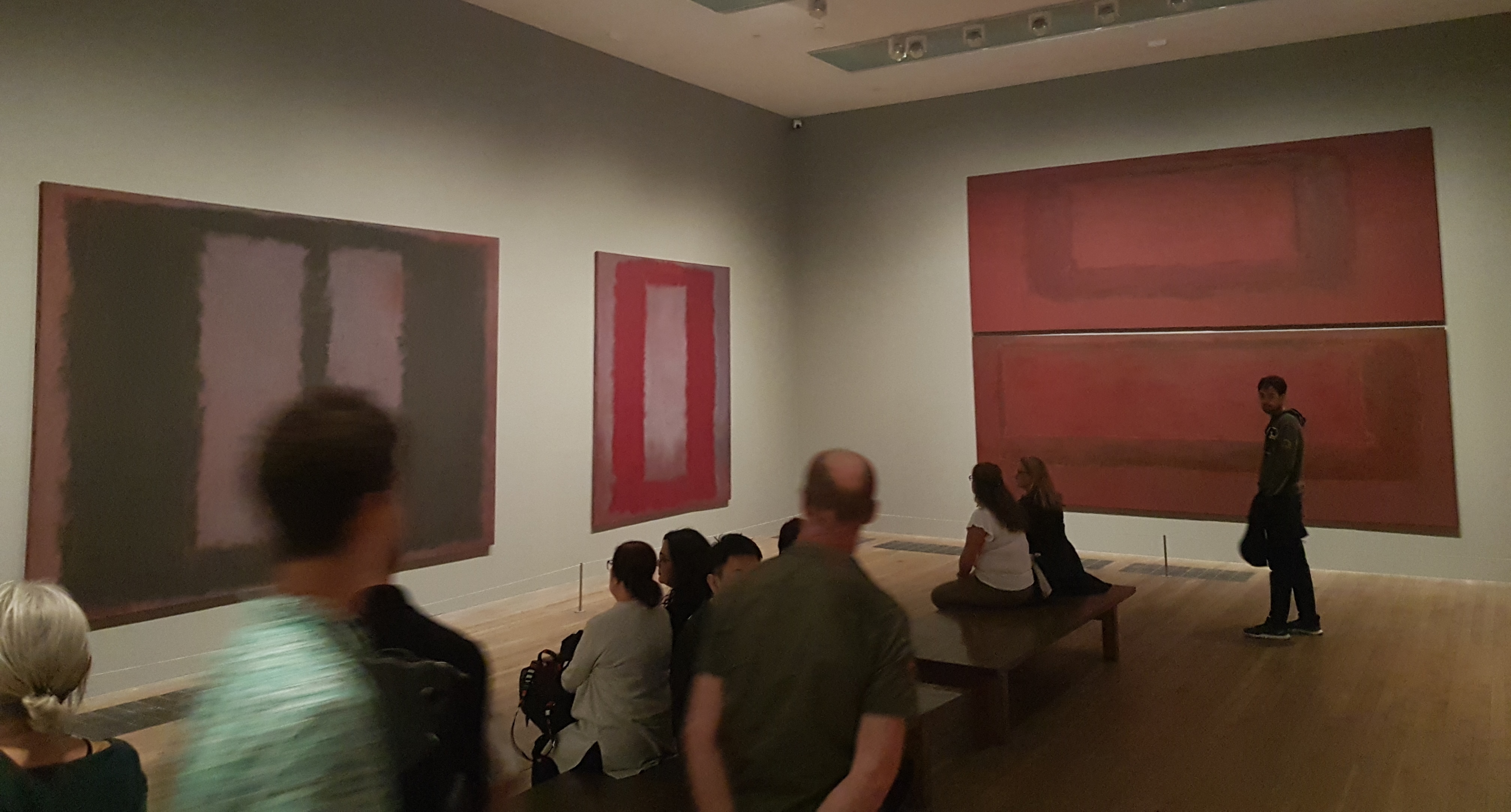
A number of other Seagram paintings by Rothko, at Tate Modern in London
Deep emotionIn 2014-2015, the Gemeentemuseum organized the first retrospective exhibition of Rothko's work in the Netherlands since 1972. I was born in 1983, so this was a first and unique opportunity for me that I had to seize, of course. By then I understood the idea of the large, low-hanging, layered canvases and was ready to be overwhelmed. But painting after painting nothing happened; it didn't move me, didn't hit me – until I got to Untitled (Seagram Mural sketch). Suddenly I did feel the emotion that Rothko had put into it, in my perception. A sad and at the same time oppressive feeling. The feeling of being taken by my throat by the painting. I would have preferred to have forgotten the world around me and to have been alone with the painting for a while, but there were too many people in the museum room for that.
Ominous gate
Perhaps I should have left it with that feeling I can barely put into words – some things just can be expressed better in images or music – but involuntarily I began to wonder what this canvas had that the other works did not have. Was it the use of colour? I think that plays a role, because the reddish-brown works from around 1958-1959 appeal to me the most. In 2019 I saw a number of other Seagram works in London, but not all of them have the same effect on me. What does make the 1959 sketch differ from most of the other Rothkos, is the composition: instead of horizontal areas of colour one below the other, this painting has vertical areas of colour on top of each other, creating a kind of ominous gate that sucks you in even more than the other works. sucks. For me this effect is strongest in the sketch on the image, because there the residual shape is the darkest of all comparable Seagram works and therefore the contrast with the 'gate' is the biggest.
Unrecognizable makes recognizable
As I stood in front of the sketch and felt that oppressive sadness, I automatically thought of what I had heard in high school about the depressions Rothko was suffering from. There in that museum hall I suffered with him retroactively. In the case of Rothko’s work, and specifically the painting discussed here, I think that it is precisely the lack of a recognizable representation that causes the work of art to affect me, or even more so, move me deeply. I can't imagine a better way for portraying a mixture of anxiety and sadness, that profound emotion, than Mark Rothko did in this work.
Bronnen
Kaiser, Franz-W. (2014). Biografie. In: Kaiser, Franz-W. and others (2014). Mark Rothko; Uit de collectie van de National Gallery of Art, Washington. Veurne: Uitgeverij Hannibal for Gemeentemuseum Den Haag.
Images: own photos.