MY CLASSICS
Fiat Multipla
Cars
| 31-07-2020
Designing a compact Multi Purpose Vehicle requires a lot of creativity from the designers. That's why many midi MPVs from the late 1990s appeal to me so much. And if you commission Italian designers to be creative, there's a lot to expect!
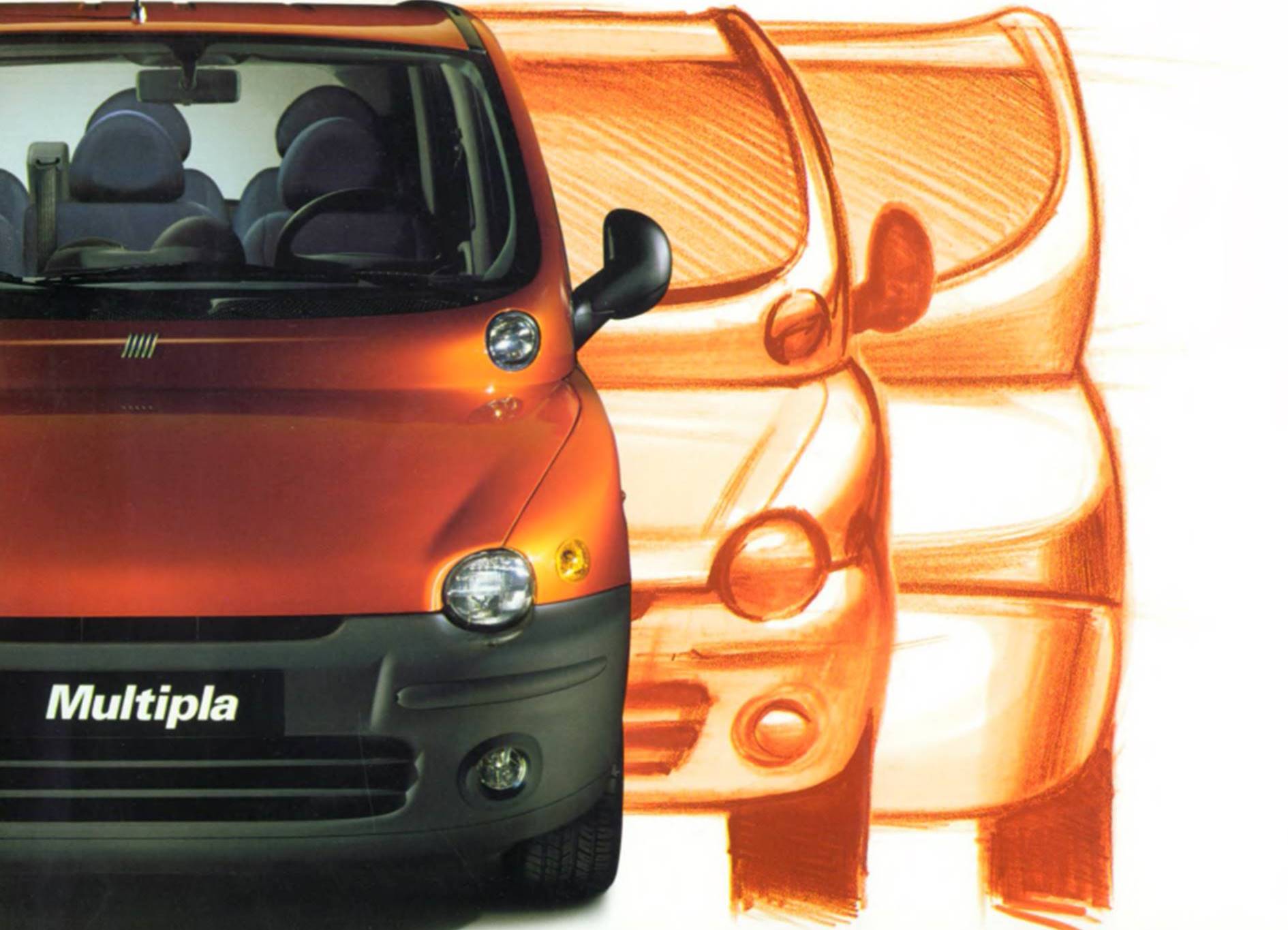
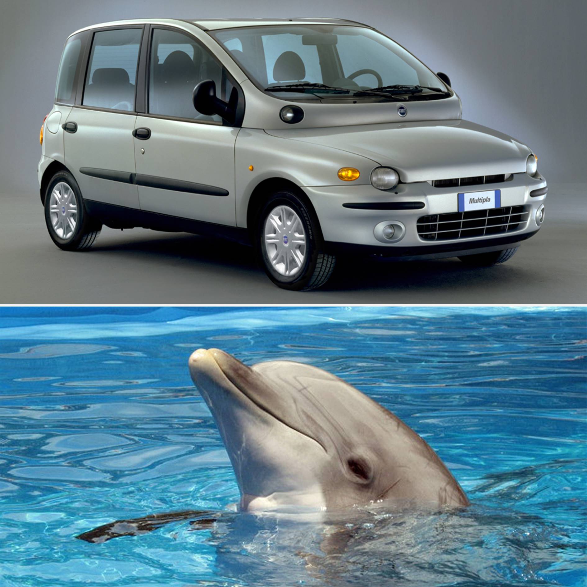
You may wonder if the Fiat Multipla is the kind of design most people have in mind when it comes to Italian design. Since its introduction, the car has evoked a wide range of reactions. For example, in The Highs & Lows of 1998 in the Dutch car magazine AutoVisie of November 21, 1998, the Multipla is honored as the most innovative car and receives bronze in the category 'The most beautiful interior', but the model also finishes first at 'The car whose designer doesn't deserve that name.' Now I can imagine that many people do not like the design of the Multipla – although I certainly do not think of it as an ugly car – but it is certainly designed, and in a very thoughtful way. The Multipla is sometimes compared to a dolphin, because of the 'bulge' under the windshield. Dolphins seem to be intelligent and social, and the Multipla certainly is.
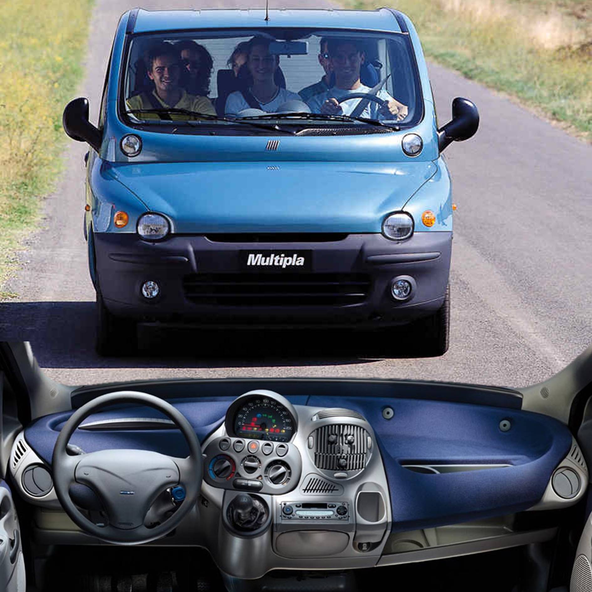
In 1996, Renault took the lead in the compact mono volume segment in Europe with the introduction of the Mégane Scénic. A car full of smart solutions and storage compartments, but with room for 'only' four adults and a child. In this respect, the Mégane Scénic was not so different from a hatchback of the same size, such as the 1997 Volkswagen Golf, which, apart from the height, also has roughly the same exterior dimensions. Mercedes-Benz came up with a number of innovations for the A-Class to make the nose shorter, so that proportionally more car length is available for the occupants, but that model can also accommodate no more than four adults and a child and at the same time has a 20 liters smaller boot than the Renault. There must be room for improvement, right? Right, witness the Multipla: although it is 14 centimeters shorter than the Mégane Scénic, six adults can sit in it, each in their own seat. On top of that they can bring 20 liters of luggage more than in the Renault. Speaking of smart solutions!
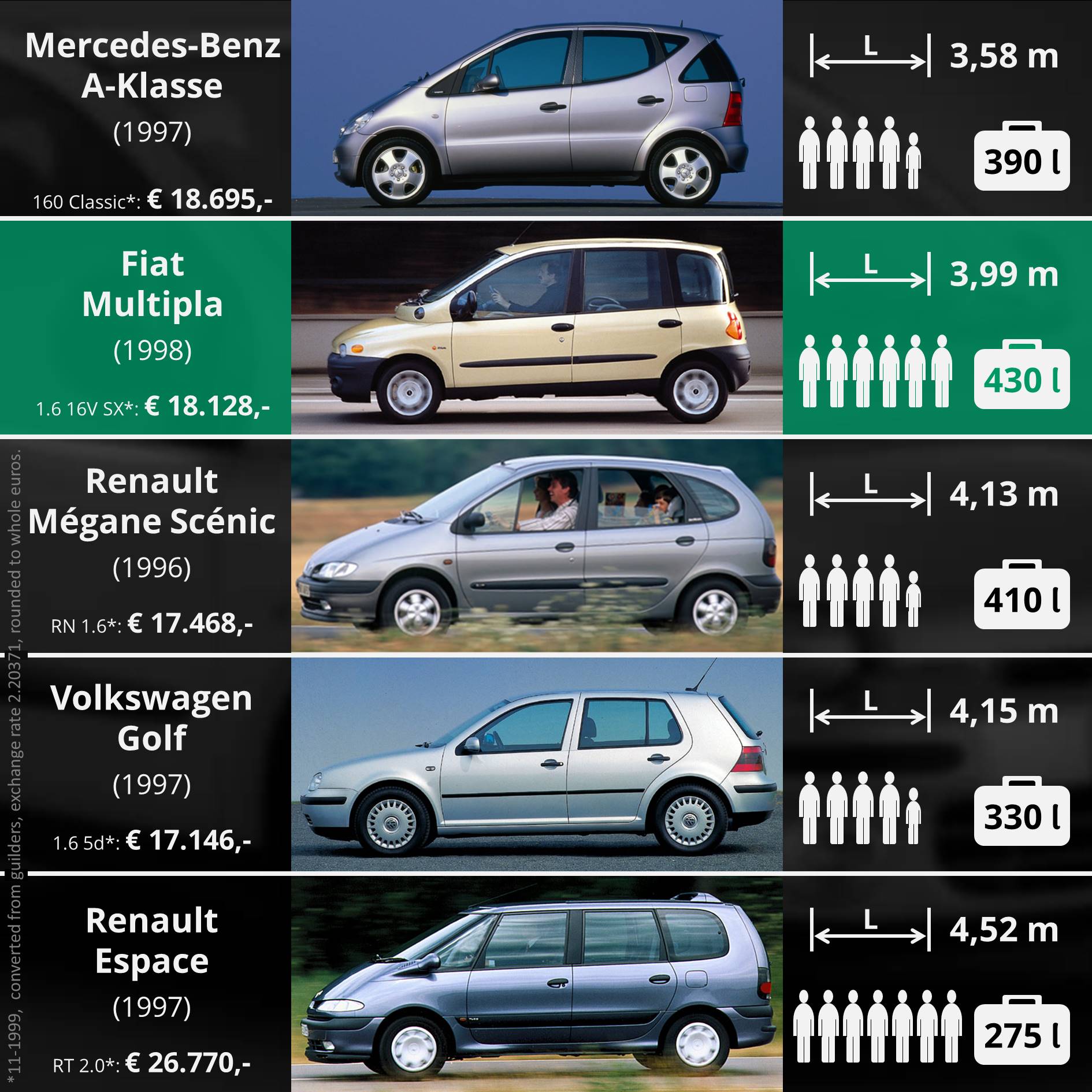
If you place three chairs next to each other, this naturally has consequences for the design. In any case, the Multipla is already about 15 cm wider than a Mégane Scénic. (That's 6 cm wider than a 1997 Renault Espace, but 5 cm narrower than a 1996 Chrysler Voyager.) In addition, the sides are upright to give occupants plenty of headroom. That in itself isn't a problem, but it tends to result in a box-shaped family van, especially at the limited length of 3.99 meters. That van appearance can be overcome by not sloping the hood as much as with a Scénic, for example, but keeping it flatter, more like on a hatchback. However, if you do that, the higher roof gives you the effect of a 'high forehead', as on some compact vans at the time and that's probably not the expression they wanted at Fiat. In addition, the designers of course have to take the aerodynamics (a good streamline, because more air resistance is detrimental to, among other things, fuel consumption) into account. Roberto Giolito's solution: combining a slightly flatter bonnet with a windscreen that starts a bit higher, with a convex strip between the bonnet and the windscreen.
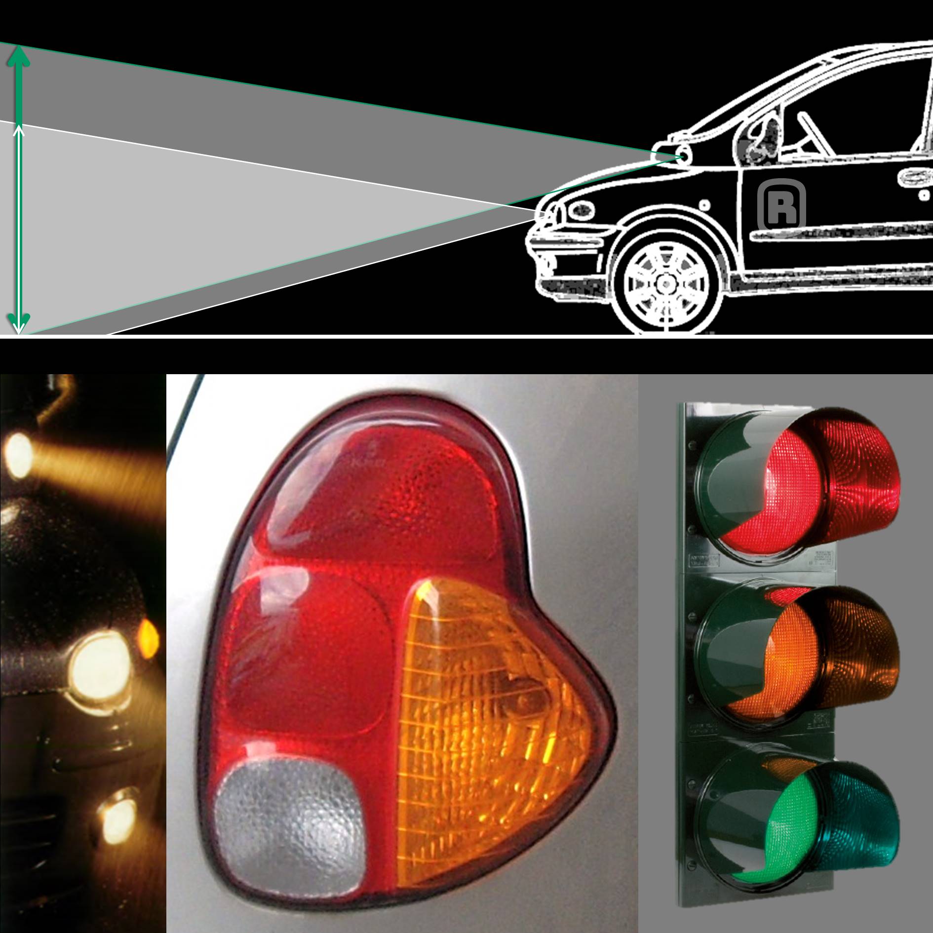
Where a dolphin uses the bulge in its head for echolocation, on the Multipla it's the location of the lamps for the driving beam. "The high and slid-back position gives them greater range and less sensitivity to the car's diving tendencies, which gives better visibility when cornering," the folder says. It provides an unusual appearance, which many people found difficult to get used to. The 2004 facelift made the car a lot more common, but in my opinion it also proved the designers of the original from 1998 right: I'd rather have an original and thoughtful design than a boring family van. Because 'the dolphin' still inspires me, as every part has been thought through with fresh eyes – in this piece I have only mentioned a fraction of it. (Do you want a little bit more than a fraction? Then keep an eye on my Instagram account.)

Fiat Multipla
Intelligent and socialYou may wonder if the Fiat Multipla is the kind of design most people have in mind when it comes to Italian design. Since its introduction, the car has evoked a wide range of reactions. For example, in The Highs & Lows of 1998 in the Dutch car magazine AutoVisie of November 21, 1998, the Multipla is honored as the most innovative car and receives bronze in the category 'The most beautiful interior', but the model also finishes first at 'The car whose designer doesn't deserve that name.' Now I can imagine that many people do not like the design of the Multipla – although I certainly do not think of it as an ugly car – but it is certainly designed, and in a very thoughtful way. The Multipla is sometimes compared to a dolphin, because of the 'bulge' under the windshield. Dolphins seem to be intelligent and social, and the Multipla certainly is.

With three people next to each other, overlooking a special dashboard
Smarter than the restIn 1996, Renault took the lead in the compact mono volume segment in Europe with the introduction of the Mégane Scénic. A car full of smart solutions and storage compartments, but with room for 'only' four adults and a child. In this respect, the Mégane Scénic was not so different from a hatchback of the same size, such as the 1997 Volkswagen Golf, which, apart from the height, also has roughly the same exterior dimensions. Mercedes-Benz came up with a number of innovations for the A-Class to make the nose shorter, so that proportionally more car length is available for the occupants, but that model can also accommodate no more than four adults and a child and at the same time has a 20 liters smaller boot than the Renault. There must be room for improvement, right? Right, witness the Multipla: although it is 14 centimeters shorter than the Mégane Scénic, six adults can sit in it, each in their own seat. On top of that they can bring 20 liters of luggage more than in the Renault. Speaking of smart solutions!

Smarter than the rest: 6 adults and 430 liters of luggage, with a length of only 3.99 meters
Aerodynamic boxIf you place three chairs next to each other, this naturally has consequences for the design. In any case, the Multipla is already about 15 cm wider than a Mégane Scénic. (That's 6 cm wider than a 1997 Renault Espace, but 5 cm narrower than a 1996 Chrysler Voyager.) In addition, the sides are upright to give occupants plenty of headroom. That in itself isn't a problem, but it tends to result in a box-shaped family van, especially at the limited length of 3.99 meters. That van appearance can be overcome by not sloping the hood as much as with a Scénic, for example, but keeping it flatter, more like on a hatchback. However, if you do that, the higher roof gives you the effect of a 'high forehead', as on some compact vans at the time and that's probably not the expression they wanted at Fiat. In addition, the designers of course have to take the aerodynamics (a good streamline, because more air resistance is detrimental to, among other things, fuel consumption) into account. Roberto Giolito's solution: combining a slightly flatter bonnet with a windscreen that starts a bit higher, with a convex strip between the bonnet and the windscreen.

High placed driving beam gives a bigger range; the lighting has a clear separation of functions, inspired by traffic lights
The highest lightWhere a dolphin uses the bulge in its head for echolocation, on the Multipla it's the location of the lamps for the driving beam. "The high and slid-back position gives them greater range and less sensitivity to the car's diving tendencies, which gives better visibility when cornering," the folder says. It provides an unusual appearance, which many people found difficult to get used to. The 2004 facelift made the car a lot more common, but in my opinion it also proved the designers of the original from 1998 right: I'd rather have an original and thoughtful design than a boring family van. Because 'the dolphin' still inspires me, as every part has been thought through with fresh eyes – in this piece I have only mentioned a fraction of it. (Do you want a little bit more than a fraction? Then keep an eye on my Instagram account.)

The Multipla looks a bit like a dolphin
MY CLASSICS
In the My classics section, I regularly add a model to my digital collection of classics. For that, I select cars whose design appeals to me or evokes memories. So nostalgia, and very subjective. Hence the section title: my classics.
Sources
- Dutch brochure about the Fiat Multipla (Fiat Auto - Pubblicità - Edition n. 04.2.2112.22 - S - 11/98).
- For the dimensions I consulted AutoWeek CarBase.
- The prices come from: New prices (1999). AutoWeek, 10th volume, no. 11, 44-46.
- Information about dolphins comes from the Dutch Wikipedia.
- The images (on this page and in the related posts on my Instagram account) come from another brochure about the Multipla, via autoweek.nl, and from the websites FCA Media, Daimler Media, Auto REALIDADE, AutoWeek CarBase: Volkswagen Golf,Renault Espace and Fiat Marea Weekend, bestcarmag.com, the-blueprints.com, WikiMedia Commons and from Pixabay: dolphin, Fiat 500, Citroën 2CV, Citroën ID, Volkswagen 1200/1300, backpack, ducks, pike en beetle.
