MY CLASSICS
BMW Z4
Cars
| 20-12-2020
Last year, it already passed as a Coupé, but basically the BMW Z4 is of course designed as a roadster. This open version is generally seen as the nicest of the two, and if I had to choose one, I would go for that one too. And then for the original from 2002, of course.
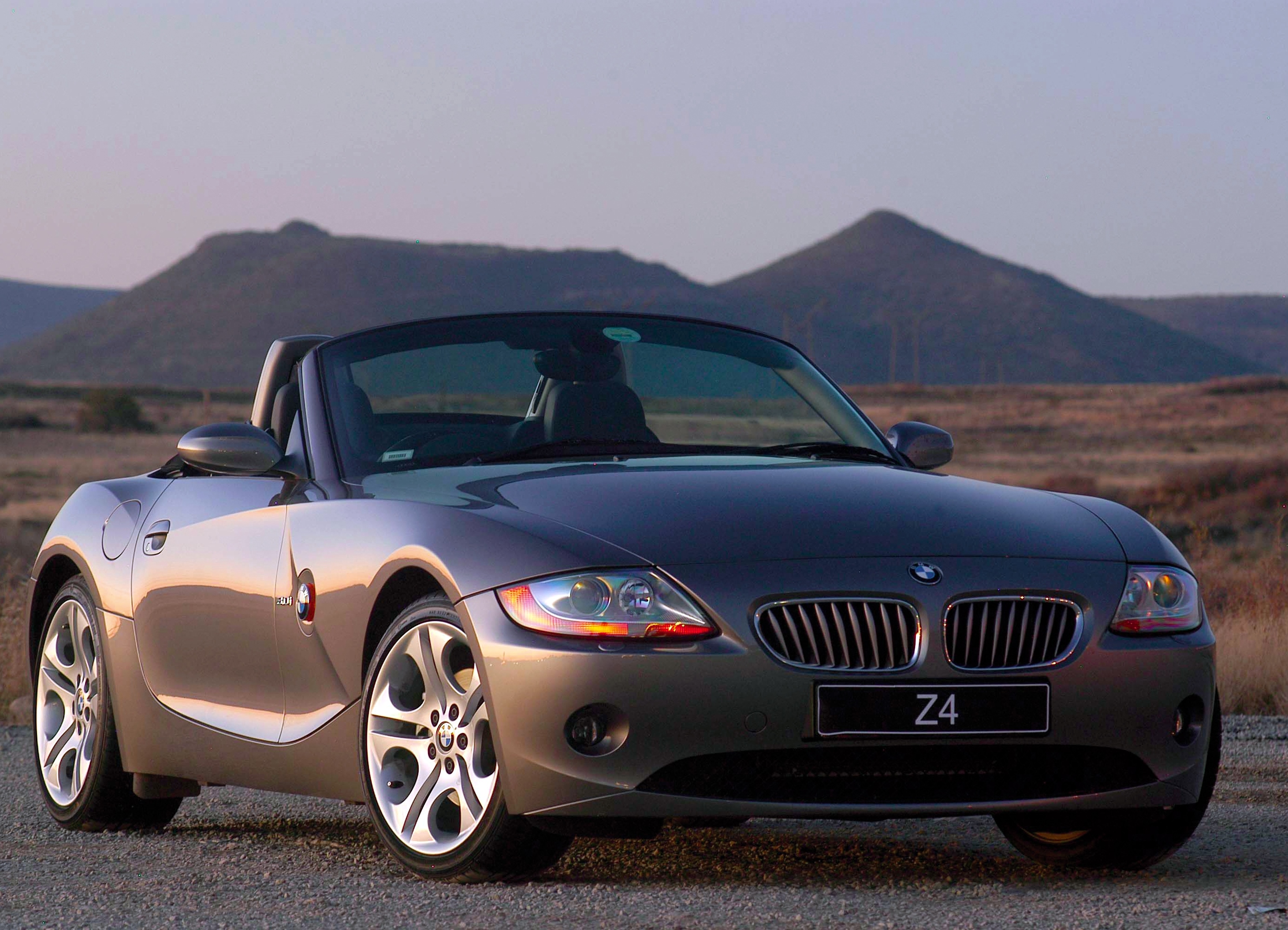
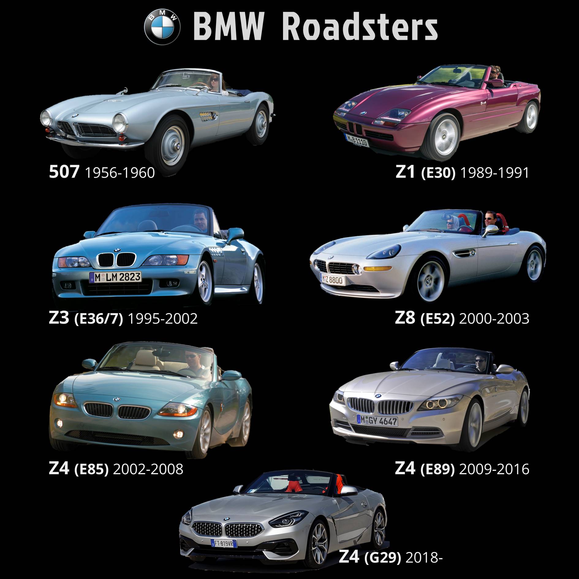
The automotive world is full of traditions and that also applies to design. Not only on a level of detail, but also in the broad outlines and proportions. One of those traditions is that a roadster is low, with a relatively long nose. This applies to other BMWs in the genre, such as the 507, Z8 and Z4 predecessors Z1 and Z3, as well as with other brands, worldwide. The Z4 also lives up to that classic roadster profile, with its front wheels placed far forward in a long nose and with a short rear overhang, a low roofline (with the roof closed) and a low sit. Within that classic profile, however, the design of the Z4 was – and is – very progressive. And although the Z4 is clearly recognizable as BMW, the design is very different from that of, for example, the Z3. The combination of sharp folds and smooth surfaces with concave and convex shapes, dubbed flame surfacing by BMW, was even somewhat controversial. The Z4 was not to everyone's taste. But it is to mine. Very much indeed.
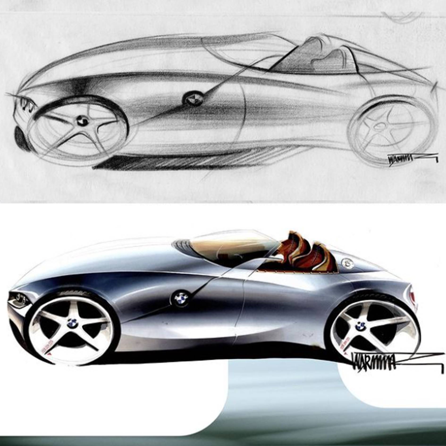
Each design is a combination of lines and surfaces. In 2002, I had been drawing cars for about ten years, almost daily, as a creative outlet, and at that time always with a mechanical pencil. Because such a pencil always has a sharp point, you can draw very sharp lines with it (if you press a little less hard and wipe the lines a bit, it is also very well possible to make soft shadows with it) and I love quick, sharp lines. A line you cannot quickly put on paper soon comes across as too made up. With that love for sharp lines, at the turn of the century, I was in luck: Ford came up with the New Edge philosophy, Renault introduced cars like the second Mégane and the Avantime and there are many more examples to mention, including BMW. Chris Bangle (of the Coupé Fiat) held sway at the BMW design department at the time, Adrian van Hooydonk (Bangles later successor as head of design) in 1999 had designed the Z9 Concept Coupé and one of the production cars the sharp lines and smooth, flowing surfaces of that study car could be found in was the Z4, a design by Anders Warming. An early sketch of his hand shows very nicely how the main lines can be put on paper in a few stripes, and yet it is already unmistakably a Z4 from generation E85.
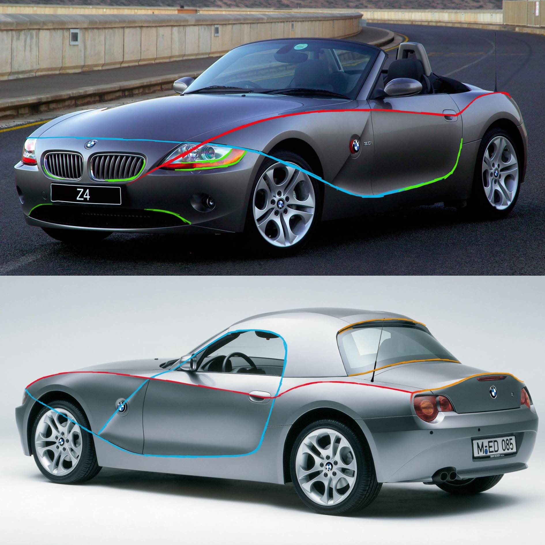
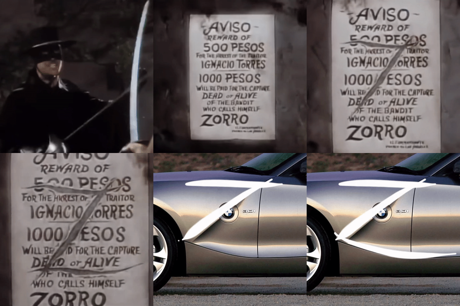
Quick, hard lines are abundant in the design of the Z4, the most striking being the Z-shape (because Z4) on the flanks. Those lines are sharp as a sword, as if Warming were playing Zorro, with his drawing tools as a sword. That Z is a nice and original detail, but what makes it a good design is that every element of that Z contributes to the overall picture: the top curvature contributes to the optical length of the nose, the diagonal is an extension of the windshield pillar, and the lower arch emphasizes the distance between the front wheel arch and the front of the door. In addition, that line (which I marked in blue in the image below) visually extends at the front into the seam separating the front bumper from the front flank and which continues above the headlights, emphasizing how low the headlights are positioned. With the roof closed, that line even runs all the way along the top of the side window to the diagonal of the Z. Also on a simpler level there are many nice inventions in the design. Take the headlights, whose arc shape at the bottom is emphasized by the turn indicators in orange (which unfortunately disappeared with the facelift in 2006). That arc shape refers to the design theme of concave and convex curves and is also a kind of echo of the arc shape in the "kidneys", the BMW-typical double grille. Because the Z in Z4 may stand for Zukunft (future), to make the car immediately recognizable as a BMW, a little tradition is indispensable.

BMW Z4
Progressive classicThe automotive world is full of traditions and that also applies to design. Not only on a level of detail, but also in the broad outlines and proportions. One of those traditions is that a roadster is low, with a relatively long nose. This applies to other BMWs in the genre, such as the 507, Z8 and Z4 predecessors Z1 and Z3, as well as with other brands, worldwide. The Z4 also lives up to that classic roadster profile, with its front wheels placed far forward in a long nose and with a short rear overhang, a low roofline (with the roof closed) and a low sit. Within that classic profile, however, the design of the Z4 was – and is – very progressive. And although the Z4 is clearly recognizable as BMW, the design is very different from that of, for example, the Z3. The combination of sharp folds and smooth surfaces with concave and convex shapes, dubbed flame surfacing by BMW, was even somewhat controversial. The Z4 was not to everyone's taste. But it is to mine. Very much indeed.

Low two-seaters with a long nose: all BMW roadsters
Quick, sharp linesEach design is a combination of lines and surfaces. In 2002, I had been drawing cars for about ten years, almost daily, as a creative outlet, and at that time always with a mechanical pencil. Because such a pencil always has a sharp point, you can draw very sharp lines with it (if you press a little less hard and wipe the lines a bit, it is also very well possible to make soft shadows with it) and I love quick, sharp lines. A line you cannot quickly put on paper soon comes across as too made up. With that love for sharp lines, at the turn of the century, I was in luck: Ford came up with the New Edge philosophy, Renault introduced cars like the second Mégane and the Avantime and there are many more examples to mention, including BMW. Chris Bangle (of the Coupé Fiat) held sway at the BMW design department at the time, Adrian van Hooydonk (Bangles later successor as head of design) in 1999 had designed the Z9 Concept Coupé and one of the production cars the sharp lines and smooth, flowing surfaces of that study car could be found in was the Z4, a design by Anders Warming. An early sketch of his hand shows very nicely how the main lines can be put on paper in a few stripes, and yet it is already unmistakably a Z4 from generation E85.

Original sketches for the Z4 by Anders Warming
Functional ZorroQuick, hard lines are abundant in the design of the Z4, the most striking being the Z-shape (because Z4) on the flanks. Those lines are sharp as a sword, as if Warming were playing Zorro, with his drawing tools as a sword. That Z is a nice and original detail, but what makes it a good design is that every element of that Z contributes to the overall picture: the top curvature contributes to the optical length of the nose, the diagonal is an extension of the windshield pillar, and the lower arch emphasizes the distance between the front wheel arch and the front of the door. In addition, that line (which I marked in blue in the image below) visually extends at the front into the seam separating the front bumper from the front flank and which continues above the headlights, emphasizing how low the headlights are positioned. With the roof closed, that line even runs all the way along the top of the side window to the diagonal of the Z. Also on a simpler level there are many nice inventions in the design. Take the headlights, whose arc shape at the bottom is emphasized by the turn indicators in orange (which unfortunately disappeared with the facelift in 2006). That arc shape refers to the design theme of concave and convex curves and is also a kind of echo of the arc shape in the "kidneys", the BMW-typical double grille. Because the Z in Z4 may stand for Zukunft (future), to make the car immediately recognizable as a BMW, a little tradition is indispensable.

A number of striking sharp and continuous lines

Sharp as Zorro's sword: the Z on the sides of the Z4
MY CLASSICS
In the My classics section, I regularly add a model to my digital collection of classics. For that, I select cars whose design appeals to me or evokes memories. So nostalgia, and very subjective. Hence the section title: my classics.
Sources
- Wheelsage.org: BMW 507, Z1 (E30), Z3 (E36/7), BMW Z8 (E52), BMW Z4 (E85) Roadster, BMW Z4 (E89), BMW Z4 (G29).
- BMW logo: Wikipedia.
- Design sketches Z4: @anders_warming_design on Instagram.
- Fragment 'Zorro': YouTube
- Pictures with coloured lines and fragment 'Z on the Z4': own work.
The images (on this page and in the related messages on my Instagram account) are form the following websites:
