ART PIECES
Har Sanders: Untitled (1971)
Visual Arts
| 21-07-2021
A detailed painting of checkered bedding; that's not the kind of visual art I'm normally passionate about. The fact that something is very cleverly painted and that I admire the maker for his craftsmanship, doesn't mean that the work does something to me. And yet, on multiple visits to Museum MORE, it was among other things a painting of a sheet that had a strange kind of attraction to me. Strange, because as a rule I'm not so fond of finely painted everyday objects, but also because I can't quite put my finger on why thís painting of a sheet does trigger me.
Abstract and figurative
My first suspicion is that it has something to do with how the painting appears to be simultaneously figurative and abstract. In fact, only black, white and grey areas can be seen. Apart from the colour, it is not much different in that respect from a red-yellow-blue composition by Mondrian. The human mind, however, does not work like that: even in abstract work, people often try to descry a recognizable image. And that is what makes this work by Sanders undeniably figurative: you clearly see more than just coloured areas: the tone, shape, size and direction of the areas evoke the idea of a sheet and if you look a little closer, you see that there is someone underneath it. Who is there and why is not mentioned, which makes the painting even more mysterious.
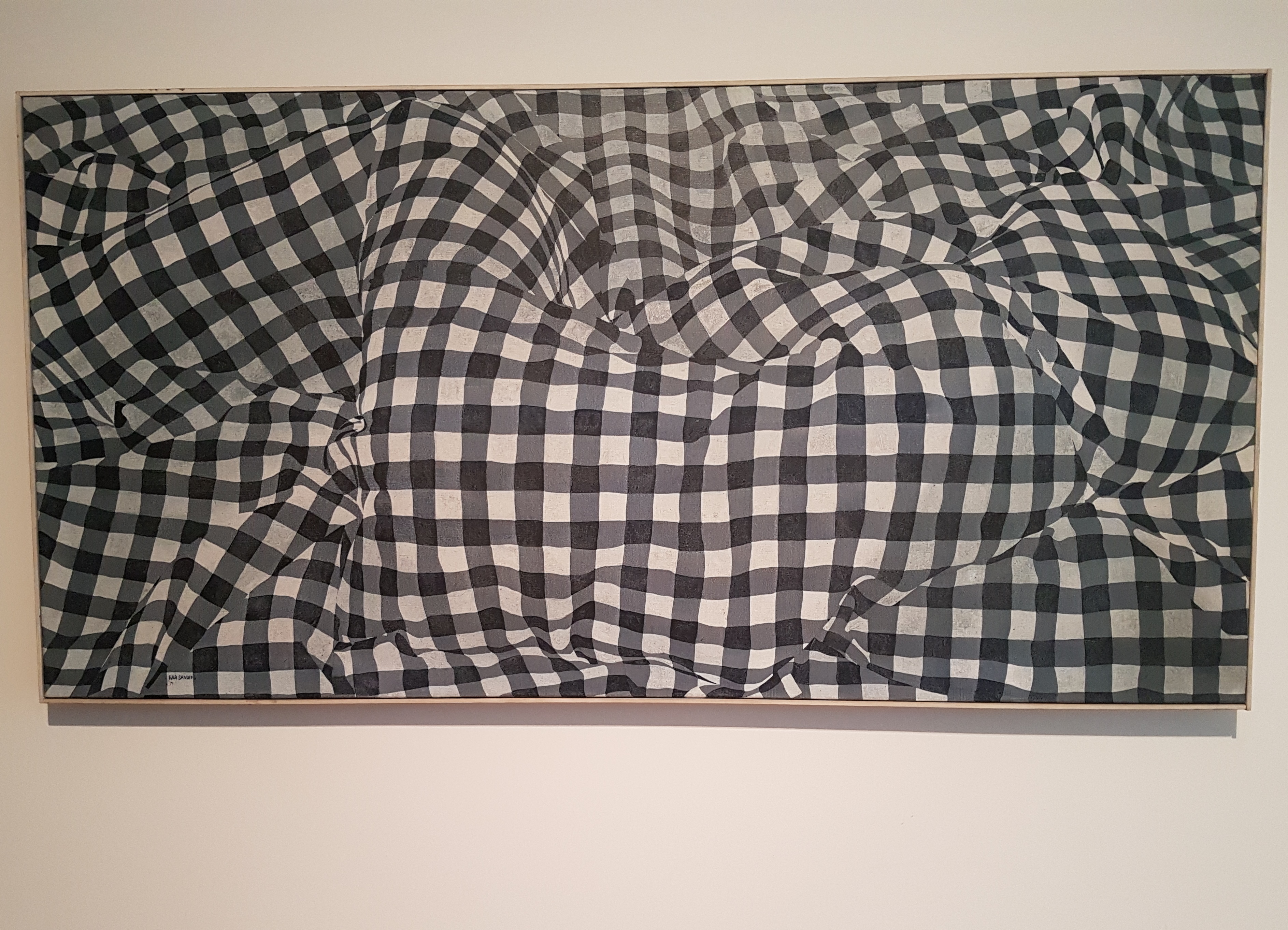
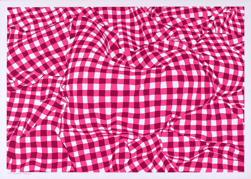
Untitled (1971) is an oil painting on canvas. In 1972 Har Sanders (1929-2010) made a screen print that is very similar to Untitled in its composition. The screen print also shows a sheet under which someone is lying, in the same sideways position with legs raised. The screen printing has a slightly squarer format and the silkscreen technique gives the whole a somewhat harder, more graphic appearance. The latter certainly applies to the prints in bright pink. Yet it is precisely the silkscreen print that does have a title, one that puts the whole thing into perspective: Jeannetje verstopt ("Jeannette hidden"). Speaking of putting things into perspective: in 1972 the Van Abbemuseum organized the exhibition Relativerend realisme ("Realism putting things into perspective"), with work by Har Sanders, among others. According to the museum, the artists whose work they showed were concerned with “putting reality into prespective through the artist's view and creating a new painterly reality.” Remember that last term.
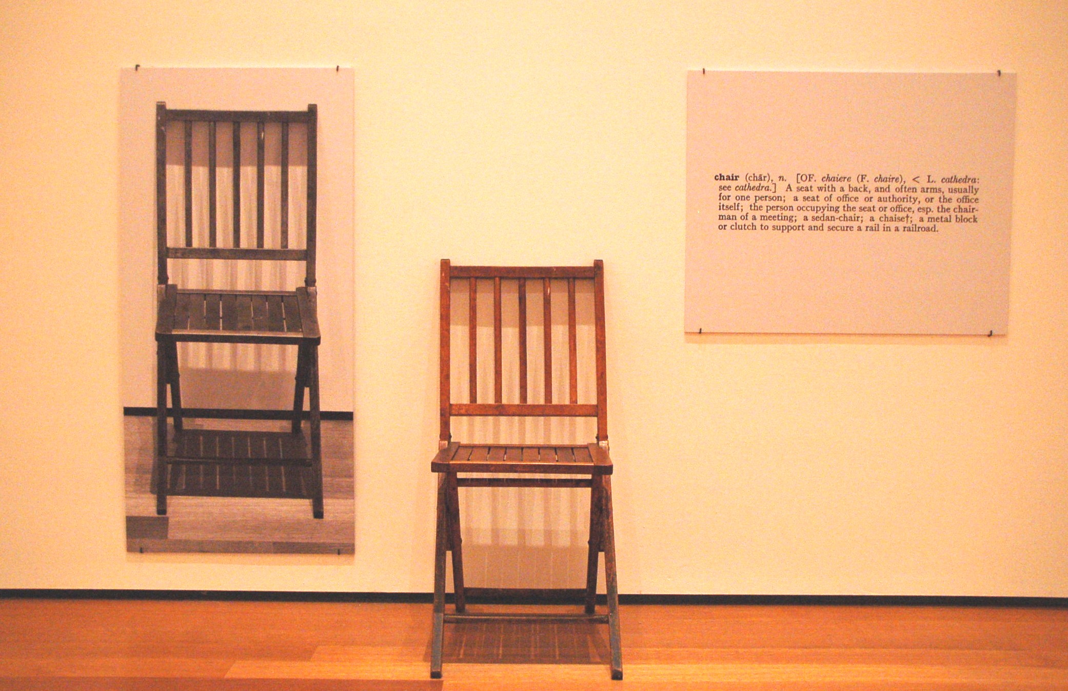
An exhibition with recent figurative work was quite something special in the seventies, in the visual arts the time of concept art, performance and land art, in line with the pop art, kinetic art, happenings, environments and installations of the sixties. Realistic figurative art that depicts the everyday has long been seen by many as something dusty from earlier times. But, as Matthijs Röling once said: 'Of course it has always existed and that goes up and down in spurts and then there is interest in it again and then it is less'. And like that around the beginning of the seventies it became a bit more. In America in the form of the more commercial and harsh hyperrealism, in the Netherlands – entirely according to the national character – in a somewhat more sober and relativizing form. That re-emergence may well be very much in line with that time. After all, reality is also questioned in that figurative work. As far as I'm concerned, Untitled (1971) by Har Sanders fits in the same line as One and Three Chairs (1965) by Joseph Kosuth and the Perspective corrections by Jan Dibbets. The question is always: what is 'real'? Is the painterly reality the same as the reality around us?
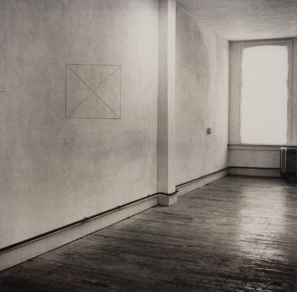
In fact, of course, that question is much older and also much more universal; think, for example, of La trahison des images (1928-1929) ["Ceci n'est pas une pipe"] by René Magritte. The spirit of the times will undoubtedly have played a role in the development that Har Sanders went through in his work, in his choice for a frame in which only the bedding is visible and no surroundings, in the relativization that appears in many of his titles ("Sink" , "Mona Lisa Vice Versa", "Latest blouse", "Dozed off pillow", "Tie patch" – all very unpretentious). No one is completely independent of his time. However, Har Sanders made his work before it became popular and continued to do so as it became more appreciated. Above all, he wanted to make good work and get better and better: “It continues to be probing, nothing is certain, everything is possible and allowed, intuitively you have to continue to work sensibly. After every painting, the question remains, had I done it like this, would it not have been better?”
Which brings us back to Untitled (1971). I think that it is precisely this painting of a sheet that manages to trigger me, partly because of the tension between figuration and abstraction and partly because of the questions it raises in me. You could call the latter the 'conceptual' or 'philosophical' side of it, although that sounds – to put it into perspective – a bit too pompous to me in this context. Maybe I'm trying too hard. In a letter from 1969, Har Sanders writes: “With really nice things by Vermeer or Saenredam, or you name it, you never think about the subject, that is a side effect, the painting is good.” Perhaps that is simply why Untitled (1971) by Har Sanders appeals to me: it is a good painting.
Abstract and figurative
My first suspicion is that it has something to do with how the painting appears to be simultaneously figurative and abstract. In fact, only black, white and grey areas can be seen. Apart from the colour, it is not much different in that respect from a red-yellow-blue composition by Mondrian. The human mind, however, does not work like that: even in abstract work, people often try to descry a recognizable image. And that is what makes this work by Sanders undeniably figurative: you clearly see more than just coloured areas: the tone, shape, size and direction of the areas evoke the idea of a sheet and if you look a little closer, you see that there is someone underneath it. Who is there and why is not mentioned, which makes the painting even more mysterious.
Har Sanders, Untitled (oil on canvas, 1971)
Realism put into perspectiveUntitled (1971) is an oil painting on canvas. In 1972 Har Sanders (1929-2010) made a screen print that is very similar to Untitled in its composition. The screen print also shows a sheet under which someone is lying, in the same sideways position with legs raised. The screen printing has a slightly squarer format and the silkscreen technique gives the whole a somewhat harder, more graphic appearance. The latter certainly applies to the prints in bright pink. Yet it is precisely the silkscreen print that does have a title, one that puts the whole thing into perspective: Jeannetje verstopt ("Jeannette hidden"). Speaking of putting things into perspective: in 1972 the Van Abbemuseum organized the exhibition Relativerend realisme ("Realism putting things into perspective"), with work by Har Sanders, among others. According to the museum, the artists whose work they showed were concerned with “putting reality into prespective through the artist's view and creating a new painterly reality.” Remember that last term.
Har Sanders, Jeannetje verstopt (silkscreen, 1972)
What is real?An exhibition with recent figurative work was quite something special in the seventies, in the visual arts the time of concept art, performance and land art, in line with the pop art, kinetic art, happenings, environments and installations of the sixties. Realistic figurative art that depicts the everyday has long been seen by many as something dusty from earlier times. But, as Matthijs Röling once said: 'Of course it has always existed and that goes up and down in spurts and then there is interest in it again and then it is less'. And like that around the beginning of the seventies it became a bit more. In America in the form of the more commercial and harsh hyperrealism, in the Netherlands – entirely according to the national character – in a somewhat more sober and relativizing form. That re-emergence may well be very much in line with that time. After all, reality is also questioned in that figurative work. As far as I'm concerned, Untitled (1971) by Har Sanders fits in the same line as One and Three Chairs (1965) by Joseph Kosuth and the Perspective corrections by Jan Dibbets. The question is always: what is 'real'? Is the painterly reality the same as the reality around us?
Joseph Kosuth, One and Three Chairs (1965)
Keep working sensiblyIn fact, of course, that question is much older and also much more universal; think, for example, of La trahison des images (1928-1929) ["Ceci n'est pas une pipe"] by René Magritte. The spirit of the times will undoubtedly have played a role in the development that Har Sanders went through in his work, in his choice for a frame in which only the bedding is visible and no surroundings, in the relativization that appears in many of his titles ("Sink" , "Mona Lisa Vice Versa", "Latest blouse", "Dozed off pillow", "Tie patch" – all very unpretentious). No one is completely independent of his time. However, Har Sanders made his work before it became popular and continued to do so as it became more appreciated. Above all, he wanted to make good work and get better and better: “It continues to be probing, nothing is certain, everything is possible and allowed, intuitively you have to continue to work sensibly. After every painting, the question remains, had I done it like this, would it not have been better?”
Jan Dibbets, Perspective Correction, My Studio I, 2: Square with 2 Diagonals on Wall (gelatin silver emulsion on canvas, 1969)
A good paintingWhich brings us back to Untitled (1971). I think that it is precisely this painting of a sheet that manages to trigger me, partly because of the tension between figuration and abstraction and partly because of the questions it raises in me. You could call the latter the 'conceptual' or 'philosophical' side of it, although that sounds – to put it into perspective – a bit too pompous to me in this context. Maybe I'm trying too hard. In a letter from 1969, Har Sanders writes: “With really nice things by Vermeer or Saenredam, or you name it, you never think about the subject, that is a side effect, the painting is good.” Perhaps that is simply why Untitled (1971) by Har Sanders appeals to me: it is a good painting.
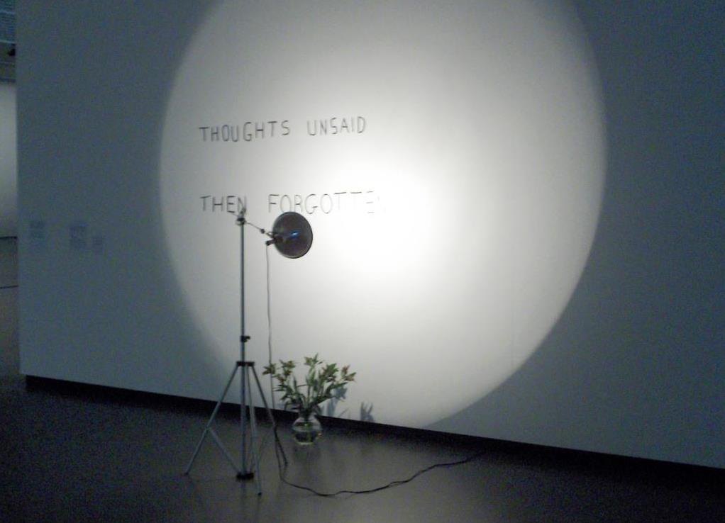
Thoughts unsaid, then forgotten
Bas-Jan Ader
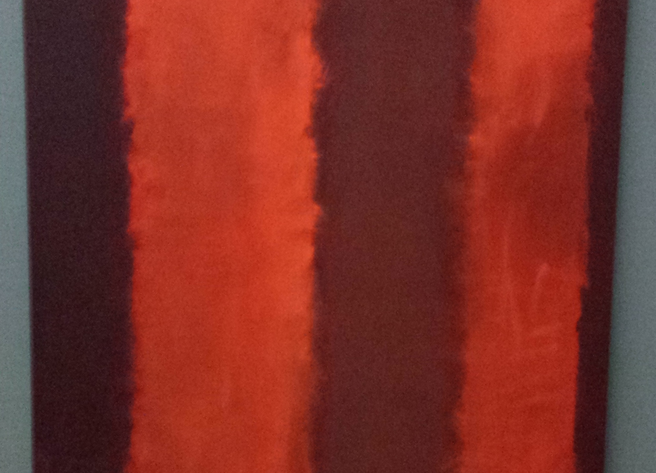
Untitled (Seagram Mural sketch)
Mark Rothko
VISUAL ARTS
Click here for an overview of everything in the Visual Arts section.