| 2022
There is a lot of beautiful printmaking: printed images such as etchings, engravings, lithographs, silk screen prints, wood- or linocuts. And because the beautiful things in life become even more beautiful when you can share them, I'm starting a digital print room. On this page I limit myself to one print per artist. You can use the links with the print to see more of the artist's work, online or – much better, of course – in real life, in galleries and museums. Do you want to know when I've added something new? Then keep an eye on my homepage or Instagram.
Anya Barabanova — Eline Brontsema — Mary Cassatt — Siemen Dijkstra — Gustave Doré — M.C. Escher — Irving Herrera — Utagawa Hiroshige — Katsushika Hokusai — Reinder Homan — Hasui Kawase — Käthe Kollwitz — Katja Lang — Jan Mankes — Edvard Munch — Héliodore Pisan — Camille Pozzo di Borgo — Rembrandt van Rijn — Anders Zorn
Anya Barabanova
unknown
Swipe the image to view the full picture
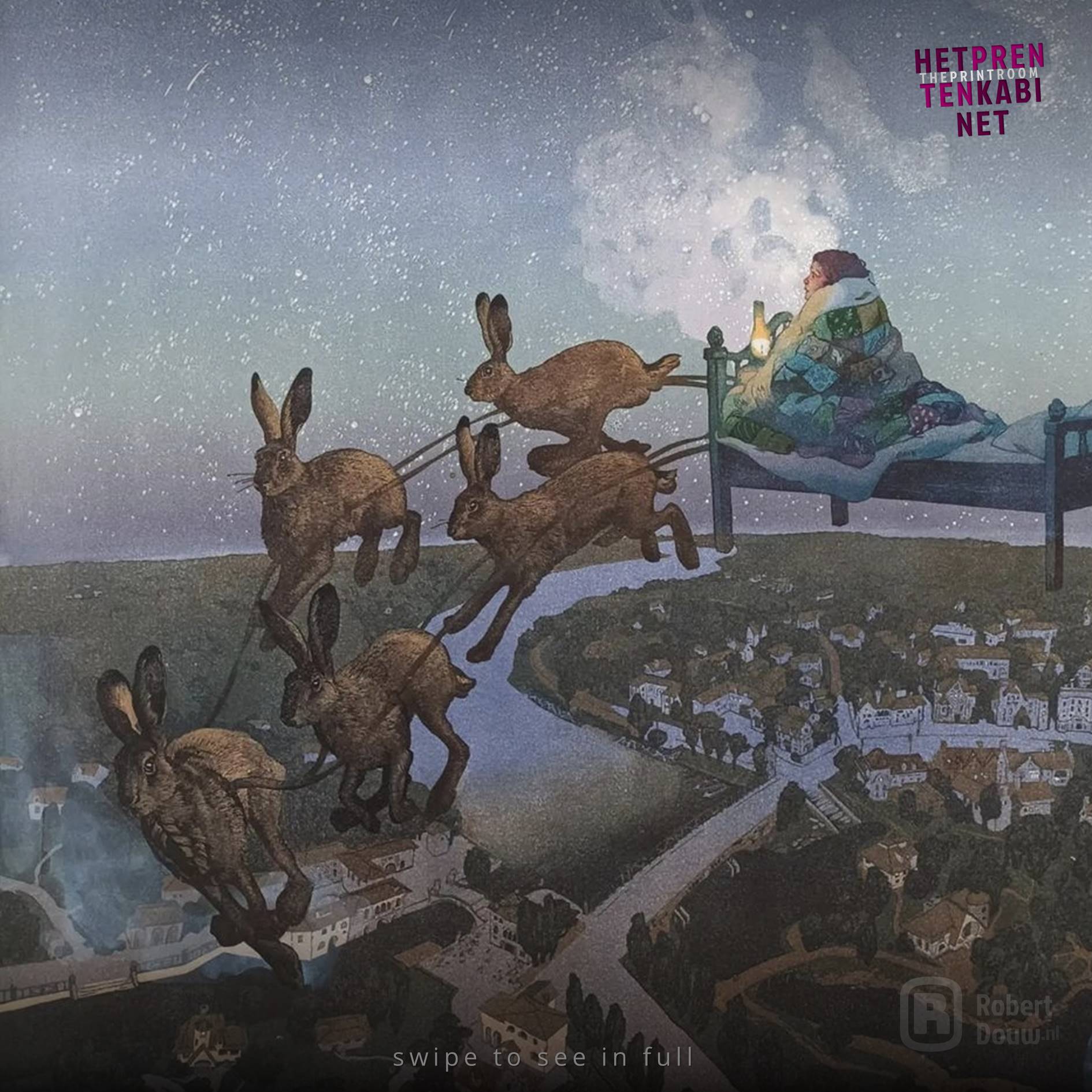
"Dreamy" and "magical". Those words keep coming up in the comments on Anya Barabanova's Instagram page. Take a look at the work above (Dreamland, 2022, reduction linocut with monotype elements, 9 layers, print size 60 x 83 cm, edition: 13 + 4 artist's proof prints), and you'll understand why. The title of course also gives a clear hint. Besides greatly appreciating the skill with which Barabanova makes her reduction prints, I also really like that dreamy quality. Her work evokes in me the association of a large, thick, hardcover book with stories and fairy tales, of course richly illustrated with Barabanova's prints, which you leaf through in a warm and comfortable place, while it is freezing cold outside. Off to dreamland!
Artist's Instagram: @lino_squirrel
Image source: instagram.com/lino_squirrel
TO TOP
Eline Brontsema
August 5, 1988
Swipe the image to view the full picture
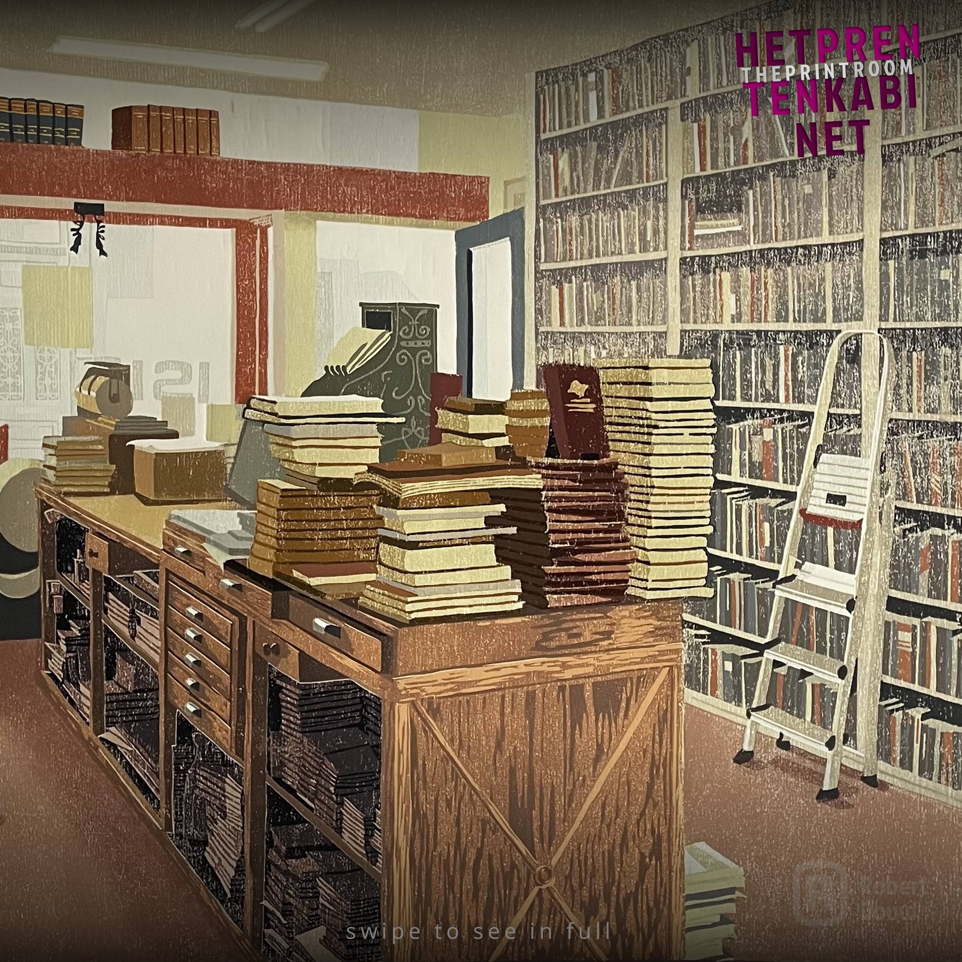
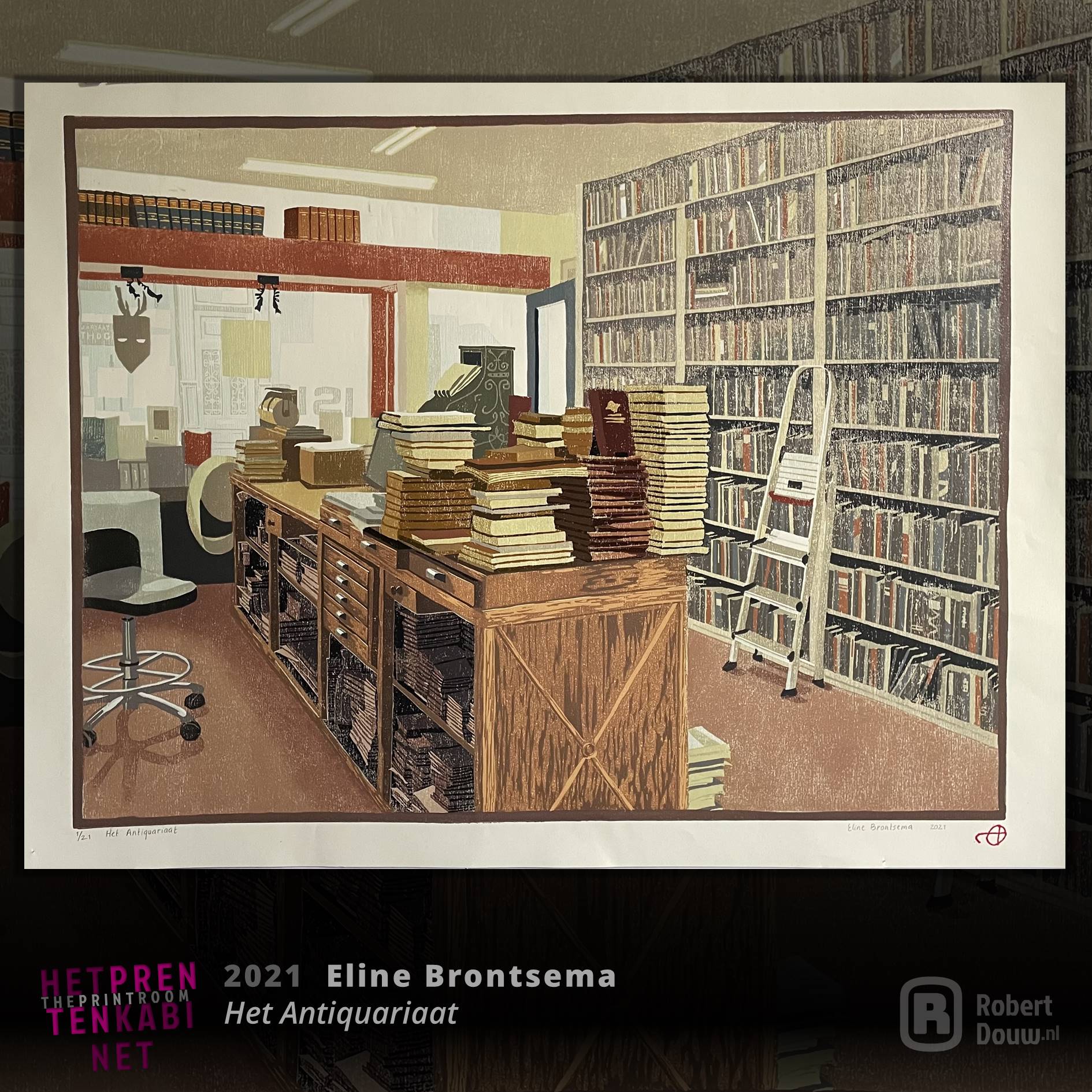
The first works by Eline Brontsema I saw were a number of woodcuts from her ten-part series Euvelgunnerheem about an old farm in Groningen. I saw them at the Graduation Exhibition of the Klassieke Academie voor Beeldende Kunst, where she is now an instructor, by the way. The above print (Het Antiquariaat [The Antiquarian Bookshop], 2021, woodcut, 41 x 54.5 cm, edition: 21) is not from that series, but it really appeals to me. I like beautiful book collections, libraries and the like. Moreover, I think it's a very attractive image, in which there is a lot to discover. Eline Brontsema suggests a lot of space by using all kinds of visual means, including line perspective, overlap, use of colour and the view through the windows. It's as if you can walk straight into the print, and then browse around between the books. Wonderful!
Artist's website: elinebrontsema.com
Artist's Instagram: @eline_brontsema
Image source: elinebrontsema.com
TO TOP
Mary Cassatt
May 22, 1844 - June 14, 1926
Swipe the image to view the full picture
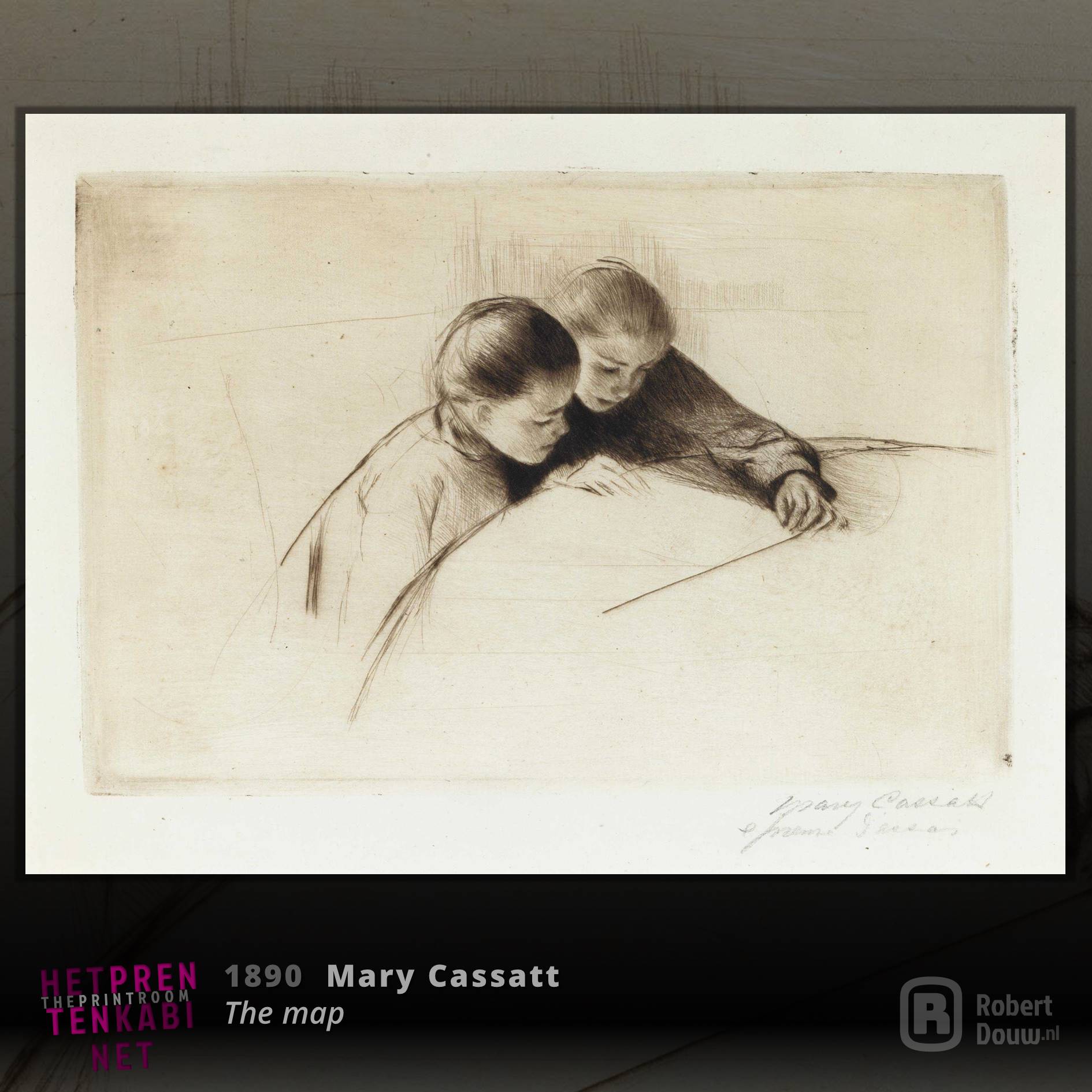
Mary Cassatt was born in the US, but has lived and worked in Europe for much of her life. She is best known for her impressionist paintings. However, her oeuvre encompasses more, both in style and technique. I think the above work (The map, 1890, drypoint on laid paper (state 3 of 3), 15.6 x 23.2 cm, edition: probably 25) is a very good example of this. In the first image you can clearly see how she has set the contours with a few sharp lines, within which she creates different tones with much finer lines. If you swipe you can see better how balanced the composition is. Cassatt suggests more than she actually depicts. Yet it is a very believable image of two girls looking at a card on the table. It is not pictured, but you can imagine it nonetheless. Masterful!
Artist on Wikipedia: Mary Cassatt
Image source: Wikimedia Commons
Museum: National Gallery of Art
TO TOP
Siemen Dijkstra
1968
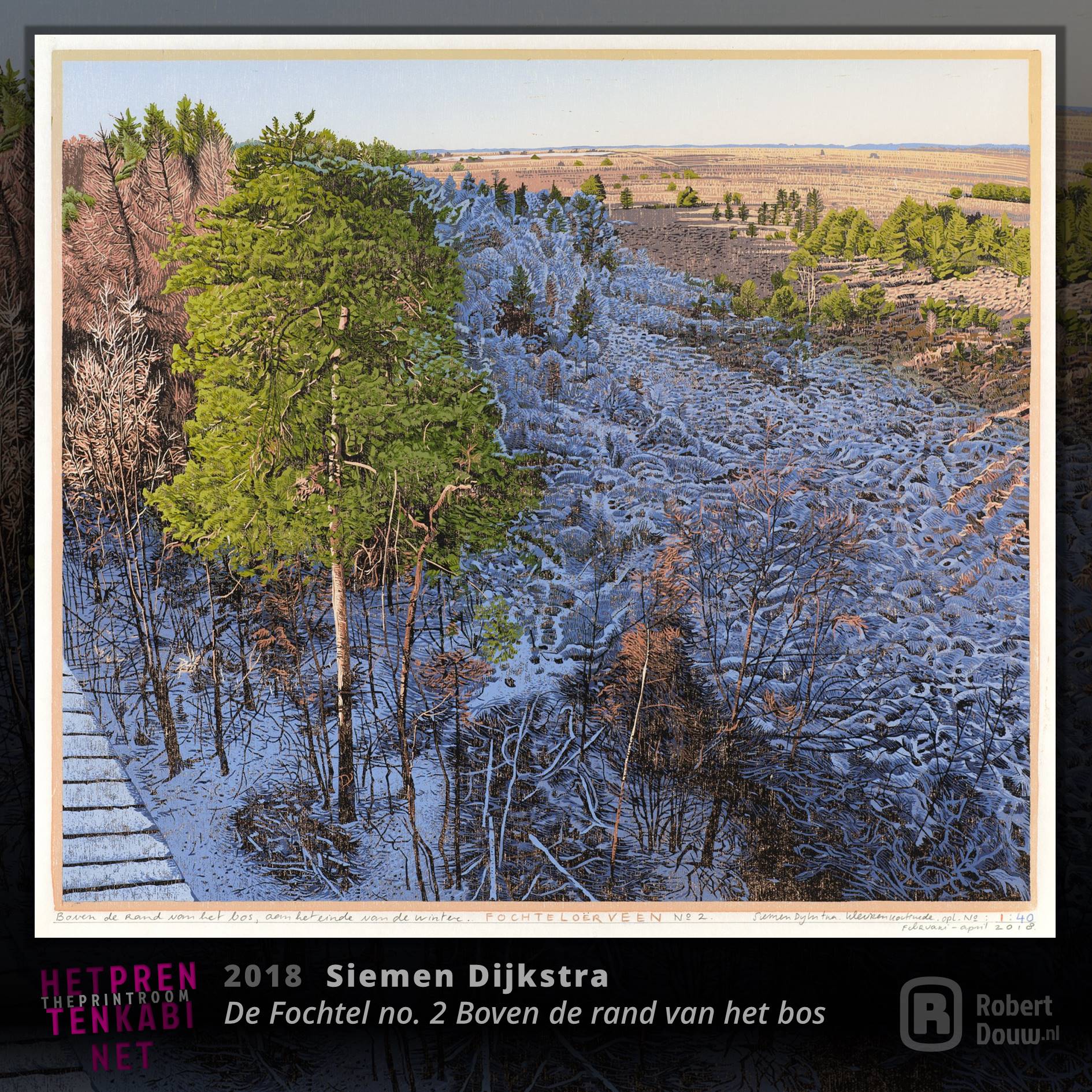
Swipe the image to view the full picture
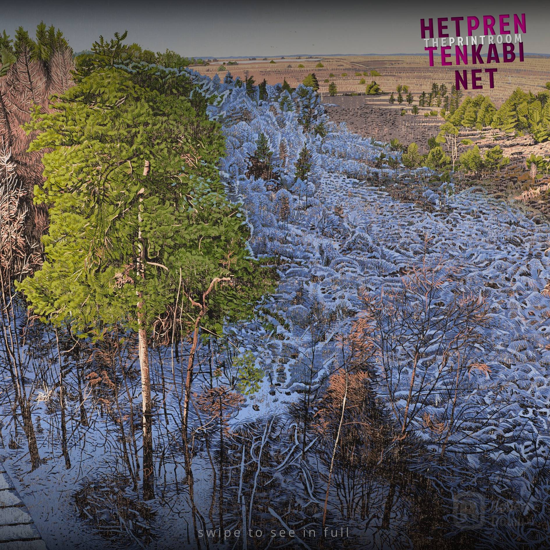
With an artist who has an oeuvre like that of Siemen Dijkstra, I could of course have chosen a lot as an exemplary print for this page. The wonderful vastness of the landscape is one of the reasons I chose the above work (De Fochtel no. 2 Boven de rand van het bos [Above the edge of the forest], 2018, woodcut, 40 x 45 cm, edition: 40). The colour contrast also appeals to me: the warm colours where the snow has already melted and that very cold blue-grey colour of the snow in the shadow, which subtly reappears on the horizon in the atmospheric perspective. And then that one branch, almost a scratch, just off center in the foreground, catching the full light of the low winter sun. I really enjoy that a lot.
Artist's website: ateliersiemen-elysia.nl
Image source: Galerie Bonnard
TO TOP
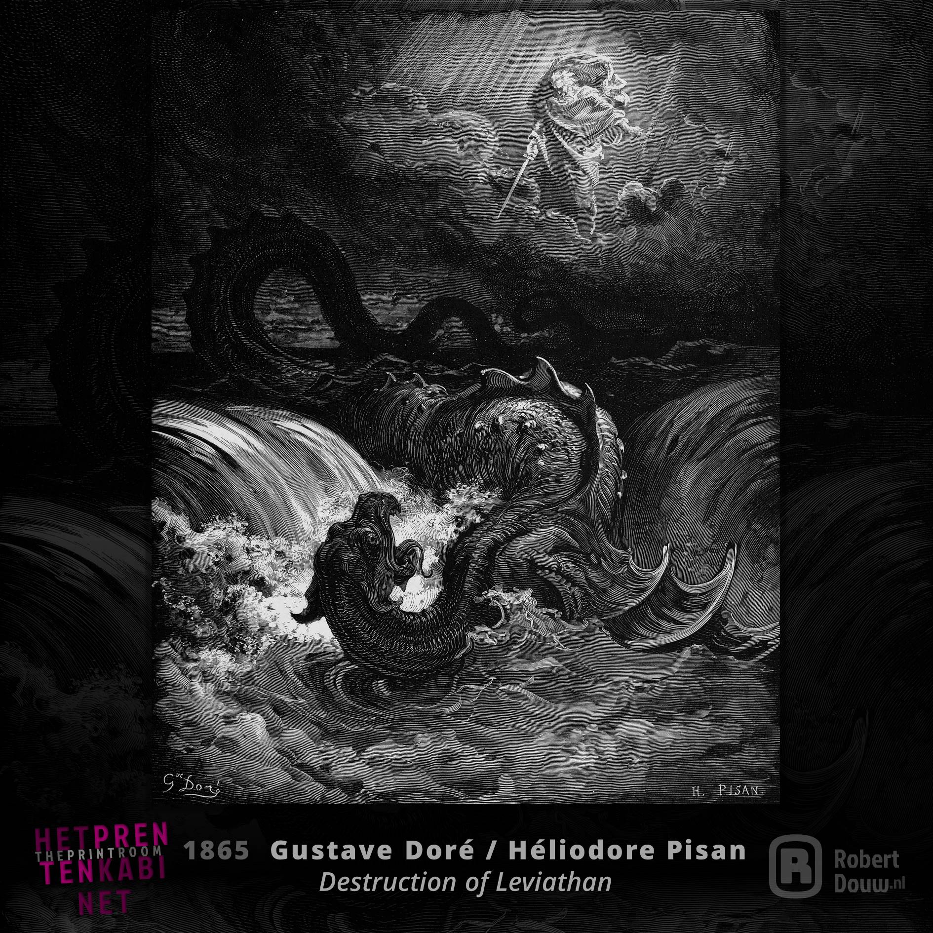
Gustave Doré / Héliodore Pisan
January 6, 1832 - January 23, 1883 / July 3, 1822 - July 18, 1890
Swipe the image to view the full picture
Leafing through my grandfather's and grandmother's The Doré Bible was my first introduction to graphics, I think. Illustrating the Bible seems like a nice job if you start from the well-known passages, but there is enough in between that is more difficult to imagine. I therefore understand that with Isaiah 27 Doré chose that one enigmatic verse about (the) Leviathan. As far as I'm concerned, that immediately results in the most beautiful and exciting plate from the Doré Bible. By the way, Doré only made the designs for all those beautiful prints; he left the actual engraving to others. This results in striking quality differences. In my opinion, Héliodore Pisan made the most beautiful engravings of Doré's drawings, including the above work (Destruction of the Leviatan (Isaiah's prophecy), 1865, engraving).
Artists on Wikipedia: Gustave Doré, Héliodore Pisan (FR)
Image source: Wikimedia Commons
Project Gutenberg: Gustave Doré
TO TOP
M.C. Escher
June 17, 1898 - March 27, 1972
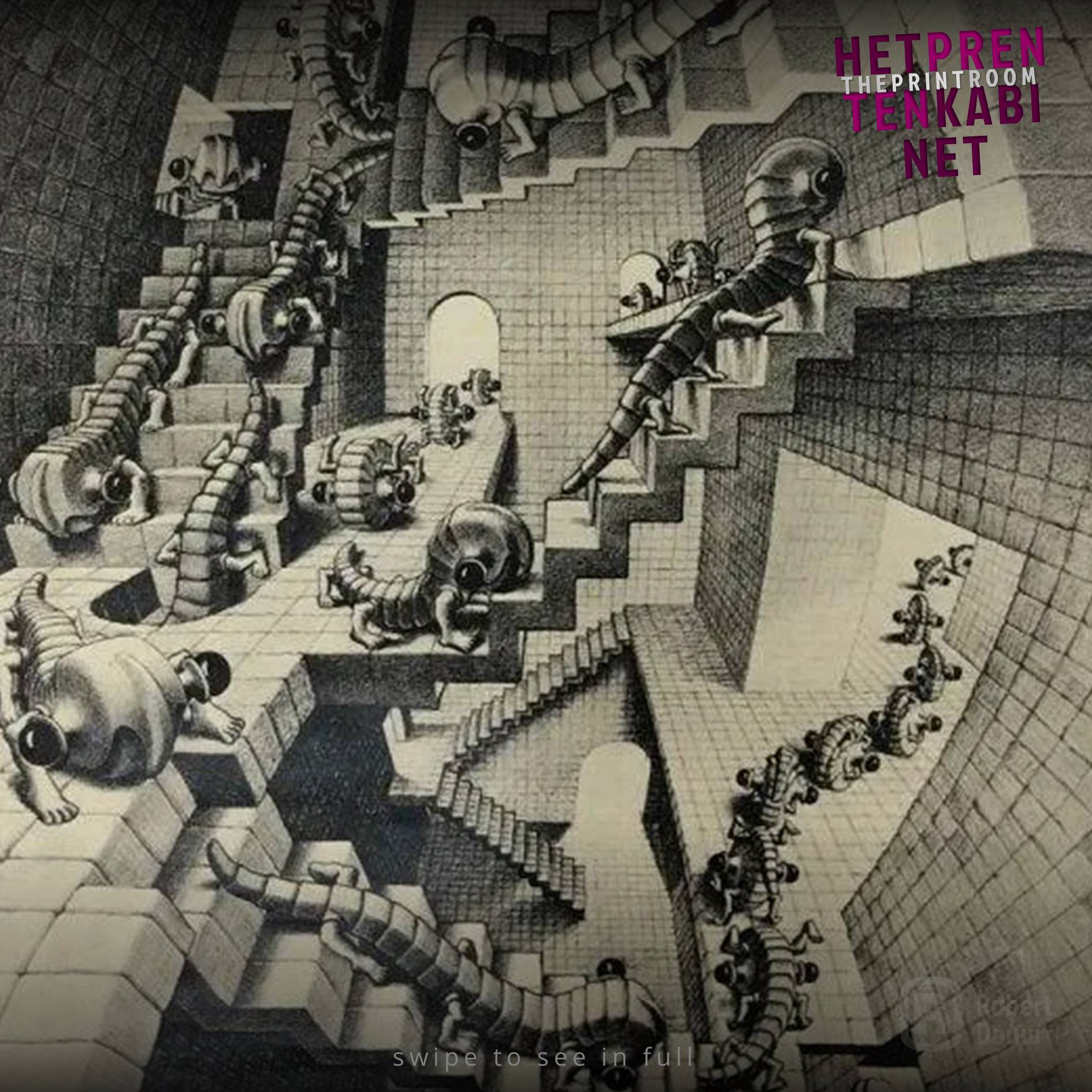
Swipe the image to view the full picture
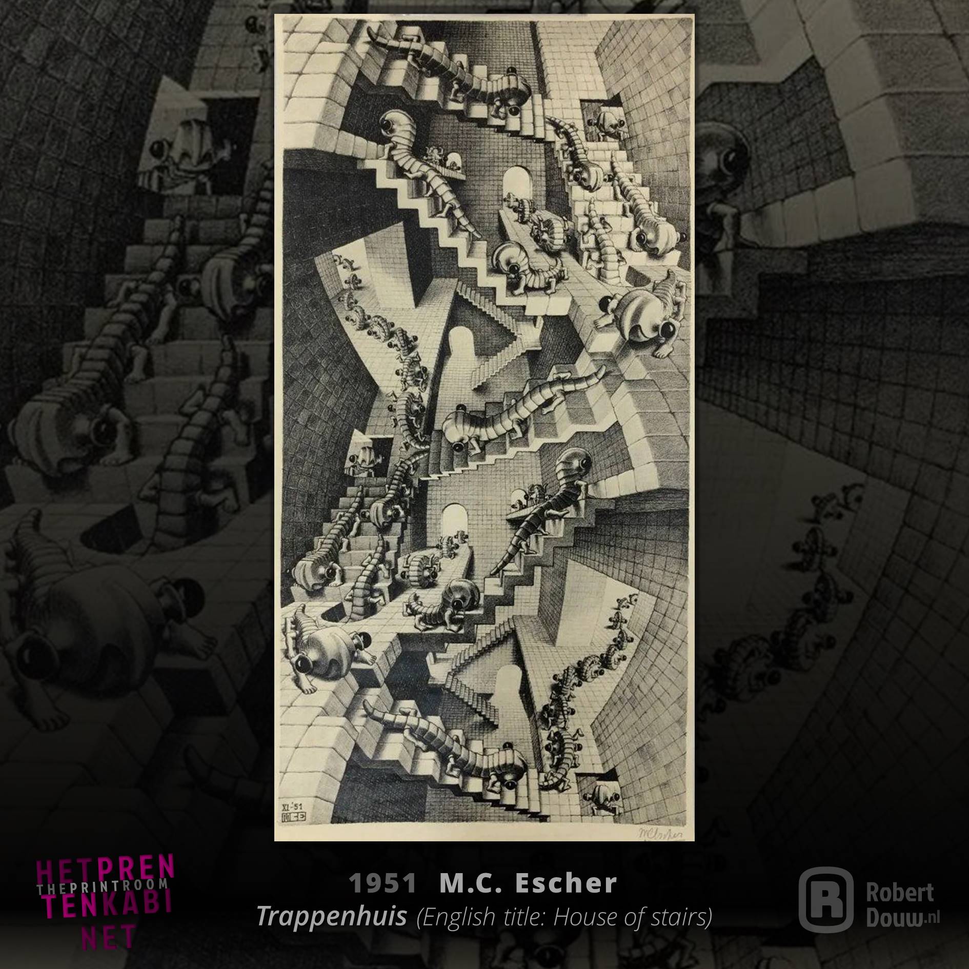
Visual arts and mathematics are sometimes presented as opposites, as are abstract thinking and fantasy, but you don't have to be Leonardo da Vinci to see that that isn't necessarily true. See also the above work by M.C. Escher (House of stairs, 1951, lithograph, 47 x 24 cm), which shows the relativity of what we observe. Escher wrote about it1: “Yet it was already known in the Renaissance that not only the horizontal parallel lines of a building intersect at a point on the horizon (the famous vanishing point), but that the vertical lines also converge at one point, downwards in the nadir and upward in the zenith.” At the same time, there is a lot of fantasy in it, not least because of the fantasy creature that Escher, with a sense of language and humor, called a wentelteefje. If that's not enough fantasy, check out this scene from the movie Labyrinth…
Artist on Wikipedia: M.C. Escher
Image source: liveauctioneers.com
Museum: Escher in The Palace
TO TOP
1Escher, M.C. (1959). M.C. Escher; Grafiek en tekeningen, ingeleid en toegelicht door de graficus (16th edition, May 1979, p. 20). Zwolle: Koninklijke Uitgeverij J.J. Tijl NV.
Irving Herrera
unknown


Swipe the image to view the full picture
Irving Herrera is an artist from Oaxaca, Mexico. He works in various techniques, including woodcuts, in formats ranging from fairly manageable to enormous. The work depicted above (Danae, 2020, woodcut) with a size of 150 x 80 cm falls into the latter category. We see a woman, an elegant flower pattern and many motifs, printed in black ink, with yellow as a supporting colour behind it. That goes for a significant amount of the work I've seen on Herrera's site and Instagram page. In my experience, the Mexican culture is more prominent in most other works than in this work. This could be due to the fact that Danae, as this woodcut is called, is a figure from Greek mythology. Be that as it may: I think it's a beautiful image above all and I also have a huge admiration for the technical skill that is required, especially at this size.
Artist's Instagram: @irving_herrera_oaxaca
Image source: irvingherrera.com
TO TOP
Utagawa Hiroshige
1797 - October 12, 1858
Swipe the image to view the full picture
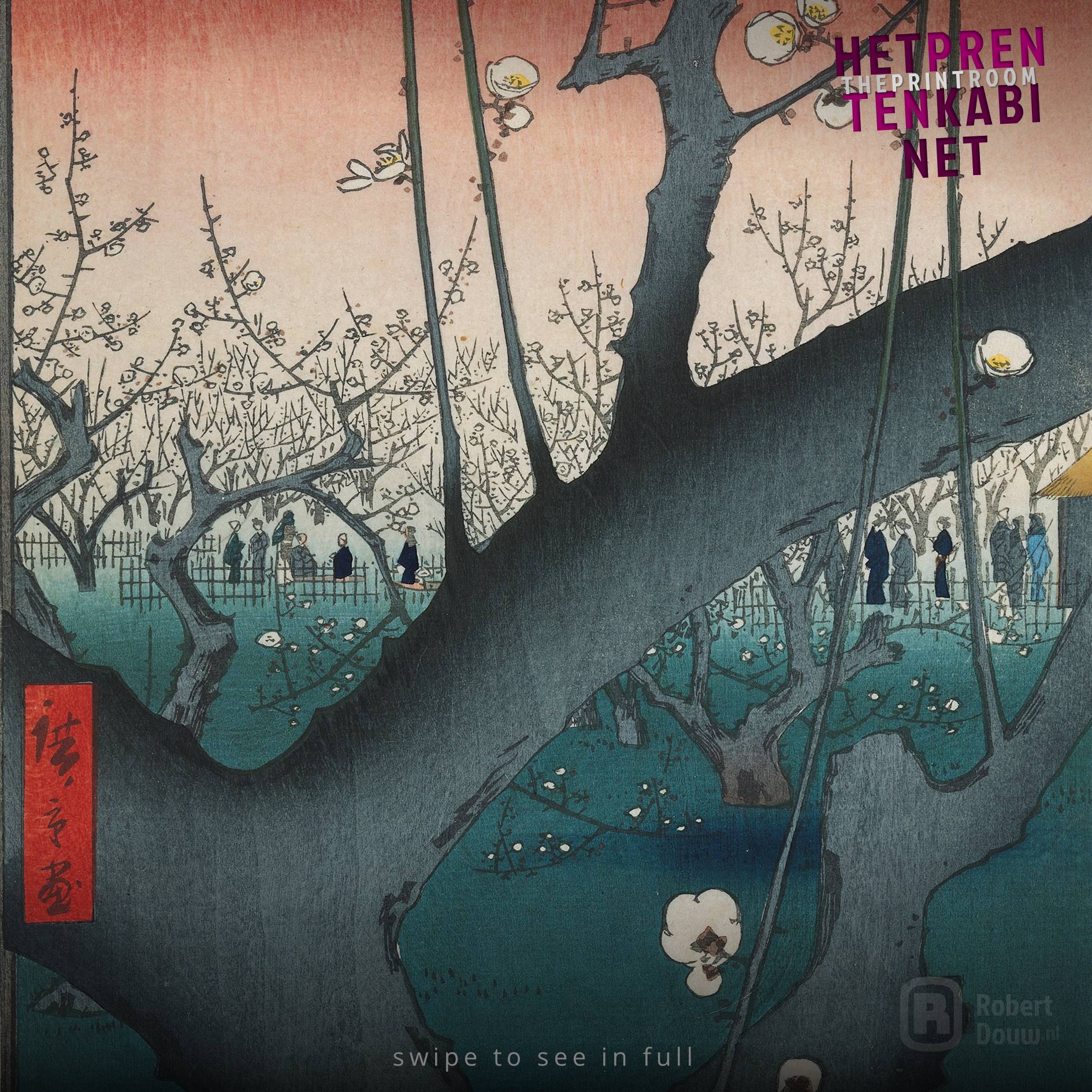
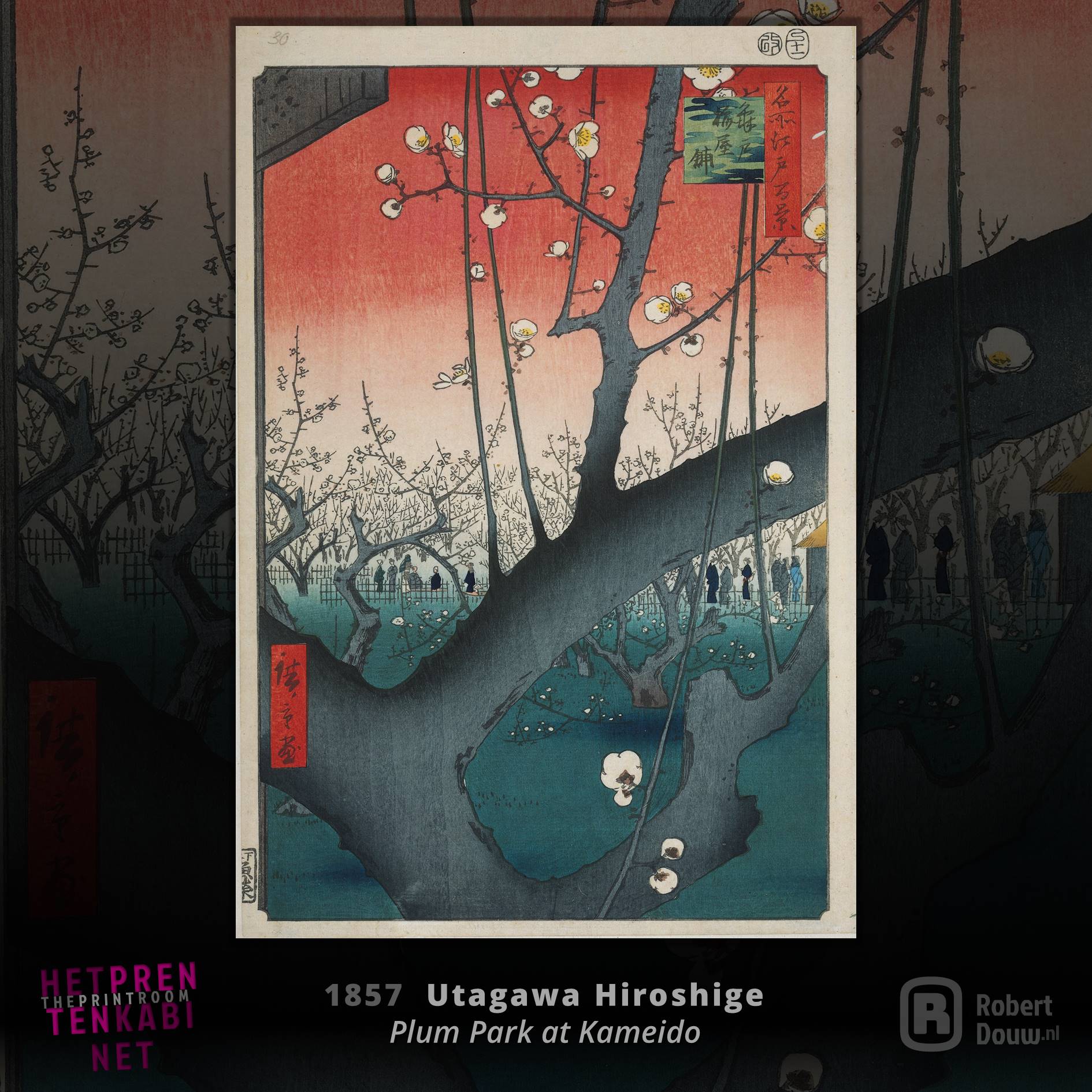
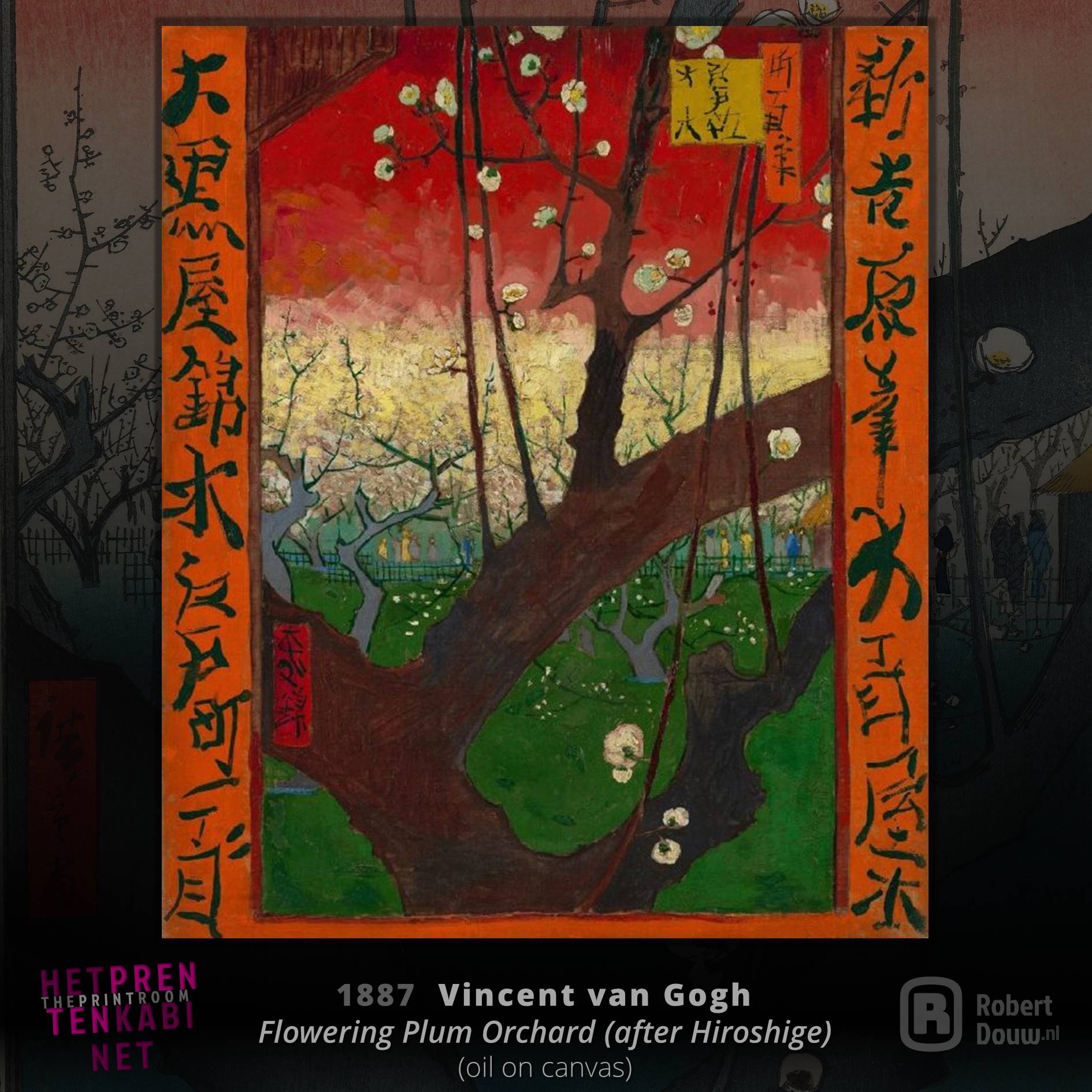
The work of Utagawa Hiroshige, or Ando Hiroshige, is more realistic and slightly less stylized than that of his older compatriot Hokusai. Hiroshige, however, had at least as much influence on Japanese art, which was studied by European artists. The latter can be taken quite literally, as is apparent from the copy Vincent van Gogh made of the above image (Plum Park at Kameido, 1857, colour woodcut; line block in black with colour blocks, 36.4 × 24.4 cm; swipe to image 3 for the Van Gogh). In this work by Hiroshige you see a very prominent repoussoir: the front tree blocks part of the background and therefore seems to really stand in front of it (which of course it isn't, because a print is a flat image). A repoussoir in itself was not new – Vermeer, for example, already made use of it – but putting something this striking in the foreground was.
Artist on Wikipedia: Hiroshige
Image source Hiroshige: rijksmuseum.nl
Image source Van Gogh: vangoghmuseum.nl
Museums: Hiroshige Museum of Art, Tendo, Hiroshige Museum of Art, Ena
TO TOP
Katsushika Hokusai
October 31, 1760 - May 10, 1849
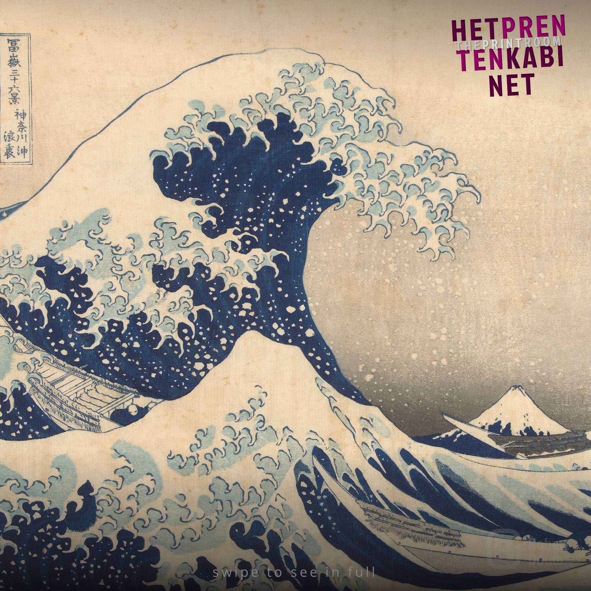
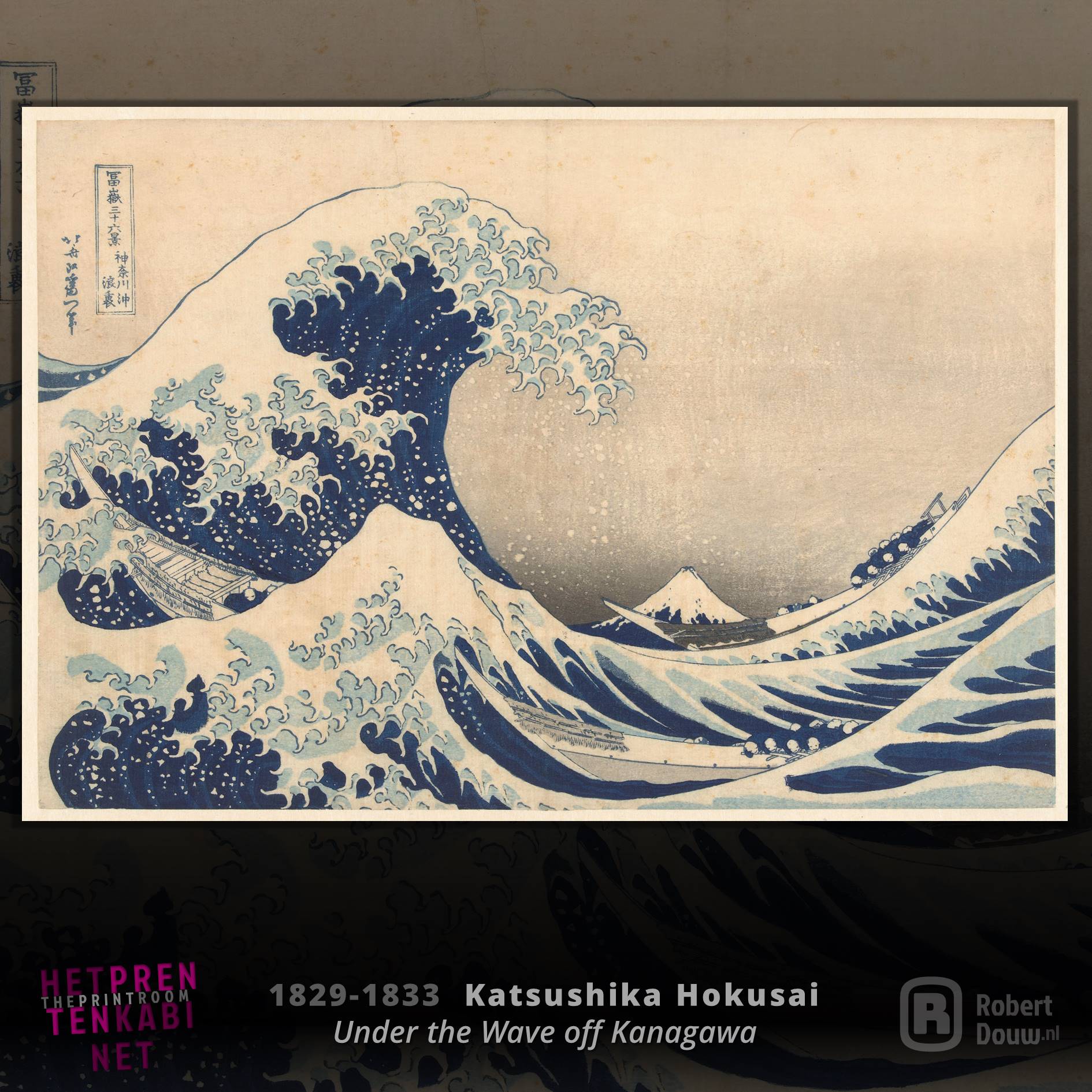
Swipe the image to view the full picture
In a section called "The Print Room", you of course cannot ignore the 19th-century Japanese woodcuts, the ukiyo-e. One of the greatest masters of that art form was Katsushika Hokusai. His work is very stylized, giving it a comic-like and familiar feel. At the time, however, this style was very innovative for Europeans, as was the technique of colour printing. One of Hokusai's most famous images comes from the series Thirty-six Views of Mount Fuji. The great wave on Great Wave off Kanagawa (1829-1833, colour woodcut; line block in black with colour blocks, 25.4 × 37.5 cm) is so iconic that it is the only artwork in the world to be made into an emoji*: 🌊. Those emoji are also from Japan, by the way. Like the ukiyo-e in the 19th century, they found their way to "the West" and influenced other visual cultures.
*On Apple devices and in some apps also on other operating systems.
Artist on Wikipedia: Hokusai
Image source: rijksmuseum.nl
Museum: Hokusai Museum, Tokyo
TO TOP
Reinder Homan
December 12, 1950
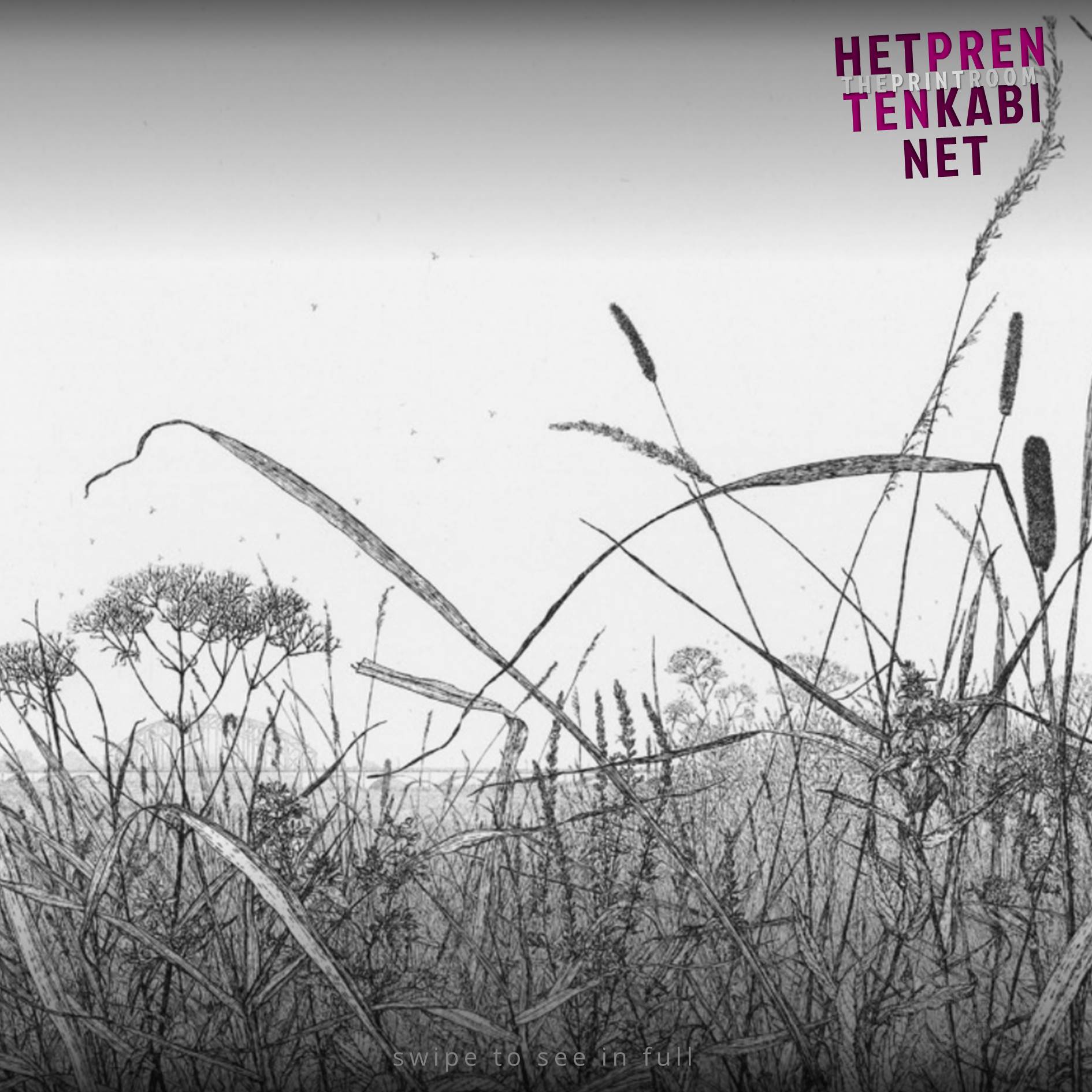
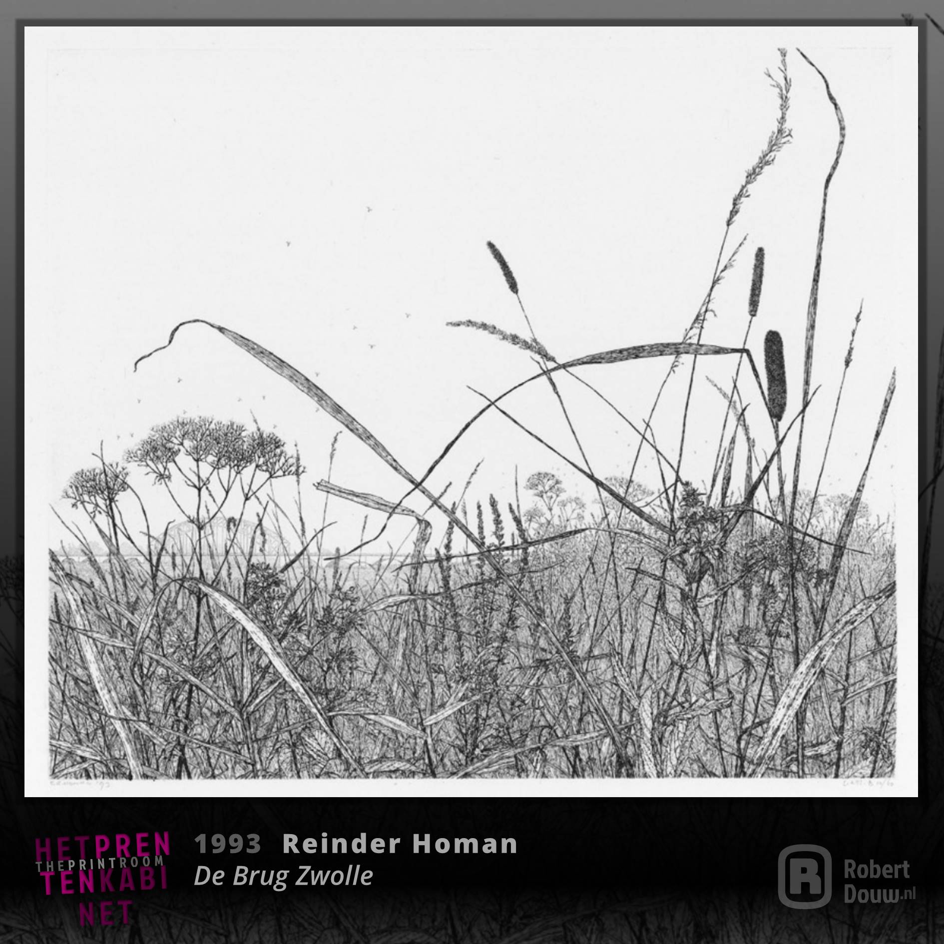
Swipe the image to view the full picture
I was able to view a large part of Reinder Homan's work in his studio, where my wife and I were very warmly welcomed by him. In the above work (De Brug Zwolle [The Bridge Zwolle], 1993, line etching, 25.5 x 30 cm, edition: 60) his handwriting as an artist is clearly visible, with a great eye for detail and the contrasting alternation between lighter and dark lines that show an unprecedented mastery of the etching technique. What I especially like about this etching is that in the distance you can see the old "IJsselbrug" between Zwolle and Hattem, over which I went to secondary school and back home twice a working day in the 1990s on my bicycle – or ran, if I had a flat tire or if there was a strong headwind…
Artist's website: reinderhoman.com
Artist on Wikipedia: Reinder Homan (in Dutch)
Image source: reinderhoman.com
TO TOP
Hasui Kawase
May 18, 1883 - November 7, 1957
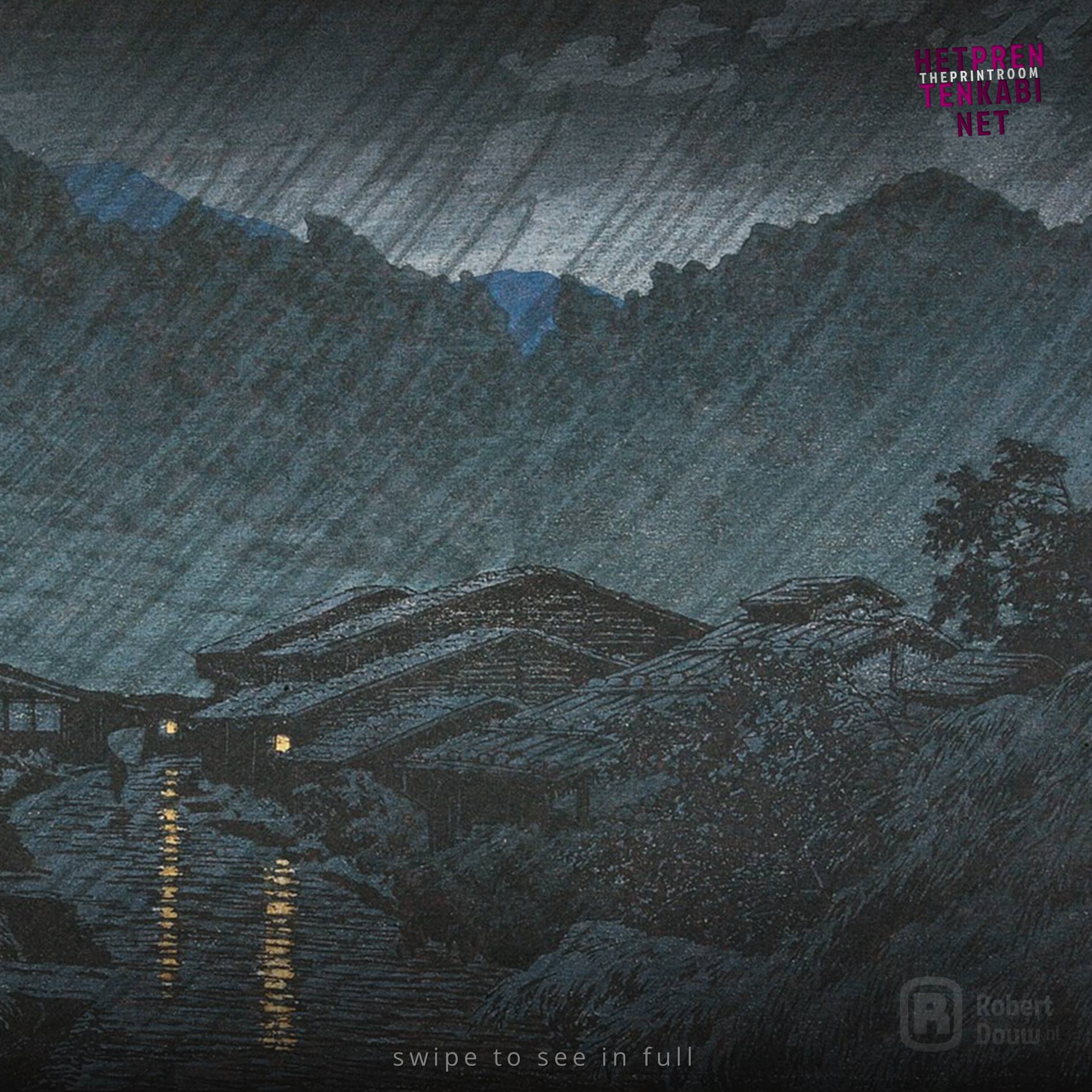
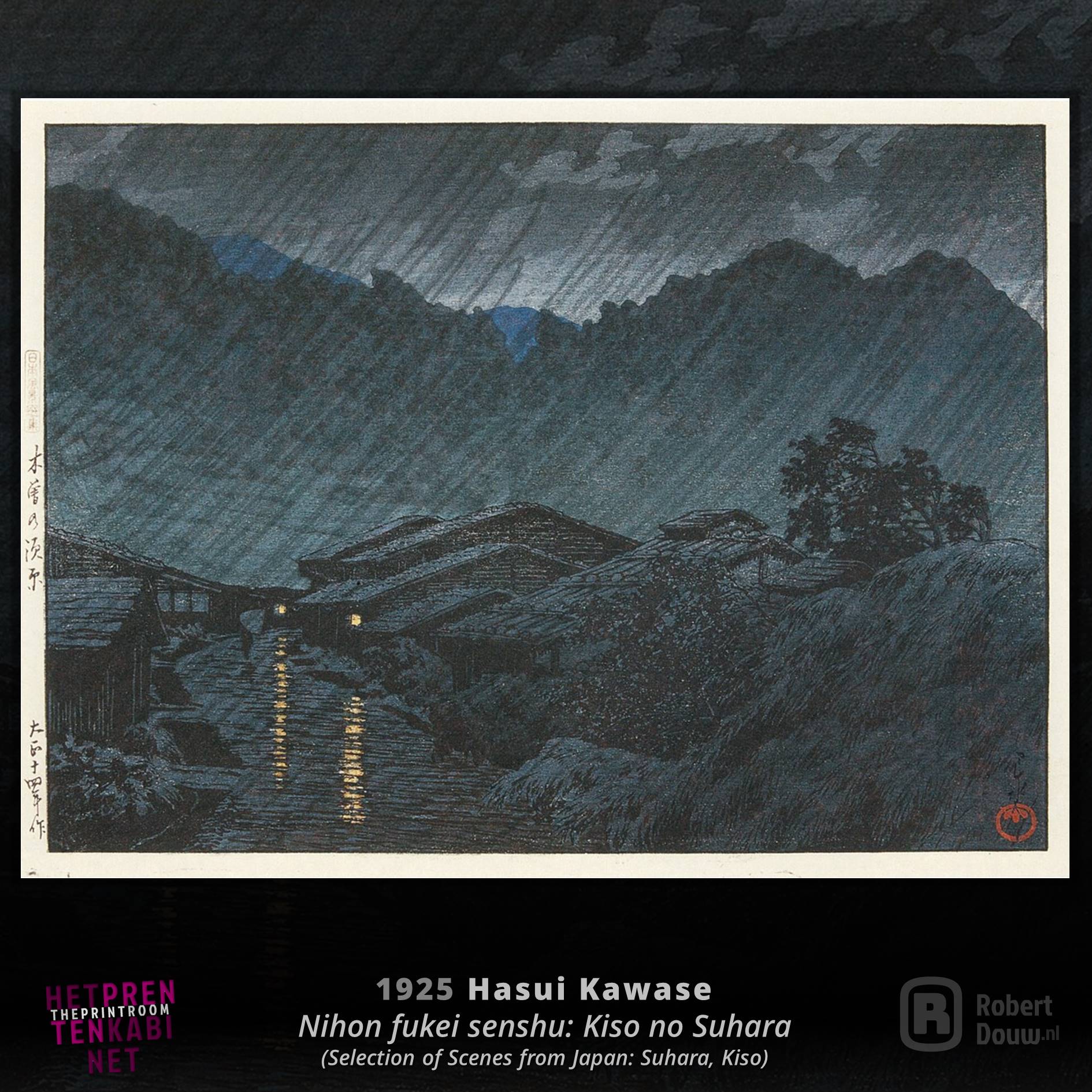
Swipe the image to view the full picture
Hasui Kawase - often called Kawase Hasui, because it is customary in Japan to say the family name first - was born Bunjiro Kawase in 1883. He is seen as the one who revived ukiyo-e and is often mentioned in the same breath as his famous predecessors Hokusai and Hiroshige. What appeals to me in much of his work and in particular in the shown above Suhara, Kiso (1925, colour woodcut, 20.7 x 28.5 cm [block]) from the series "Selection of scenes from Japan", is that I get the feeling of being present in the depicted scene. The descriptions I found on the internet say nothing about it, but it seems that Kawase drew the rain over the landscape with something like charcoal, towards the umbrella of the little figure in the lower left. If that is indeed the case, each print is even more unique than a woodcut is anyway. I would like to see his work in real life.
Artist on Wikipedia: Hasui Kawase
Image source: Wikimedia Commons
Museums: Edo-Tokyo Museum, Museum of Fine Arts (MFA), Boston, Los Angeles County Museum of Art (LACMA), Los Angeles
TO TOP
Käthe Kollwitz
July 8, 1867 - April 22, 1945
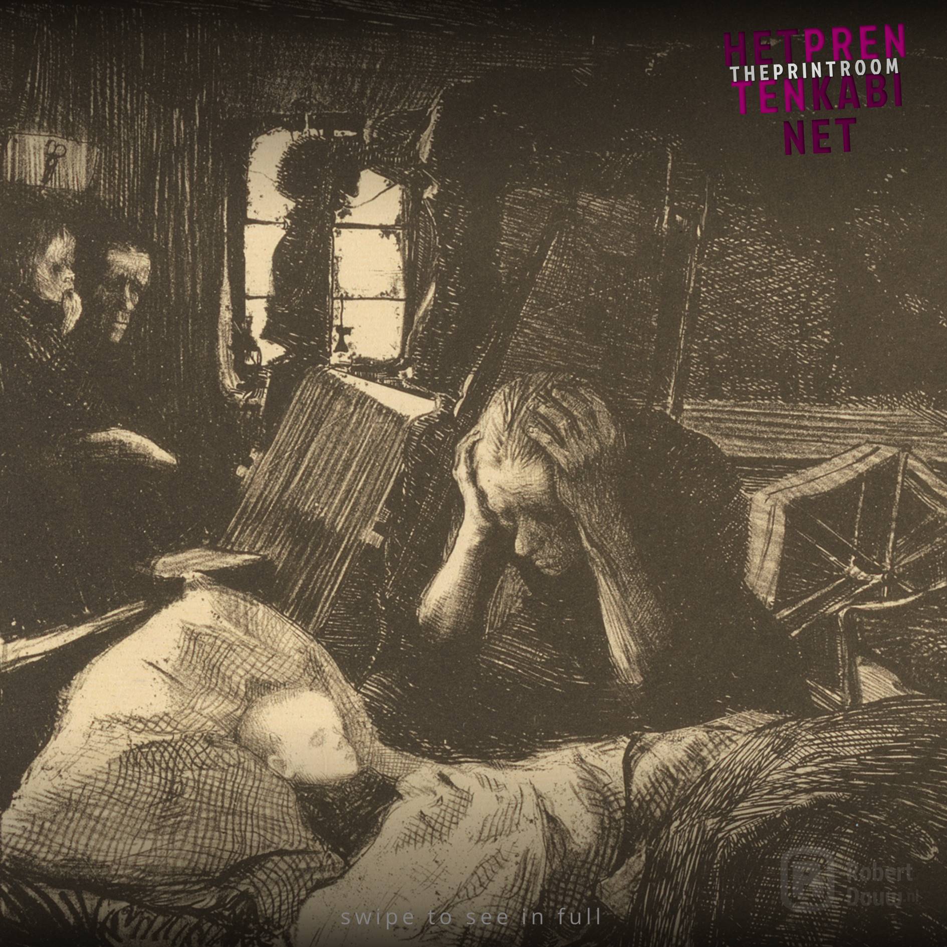
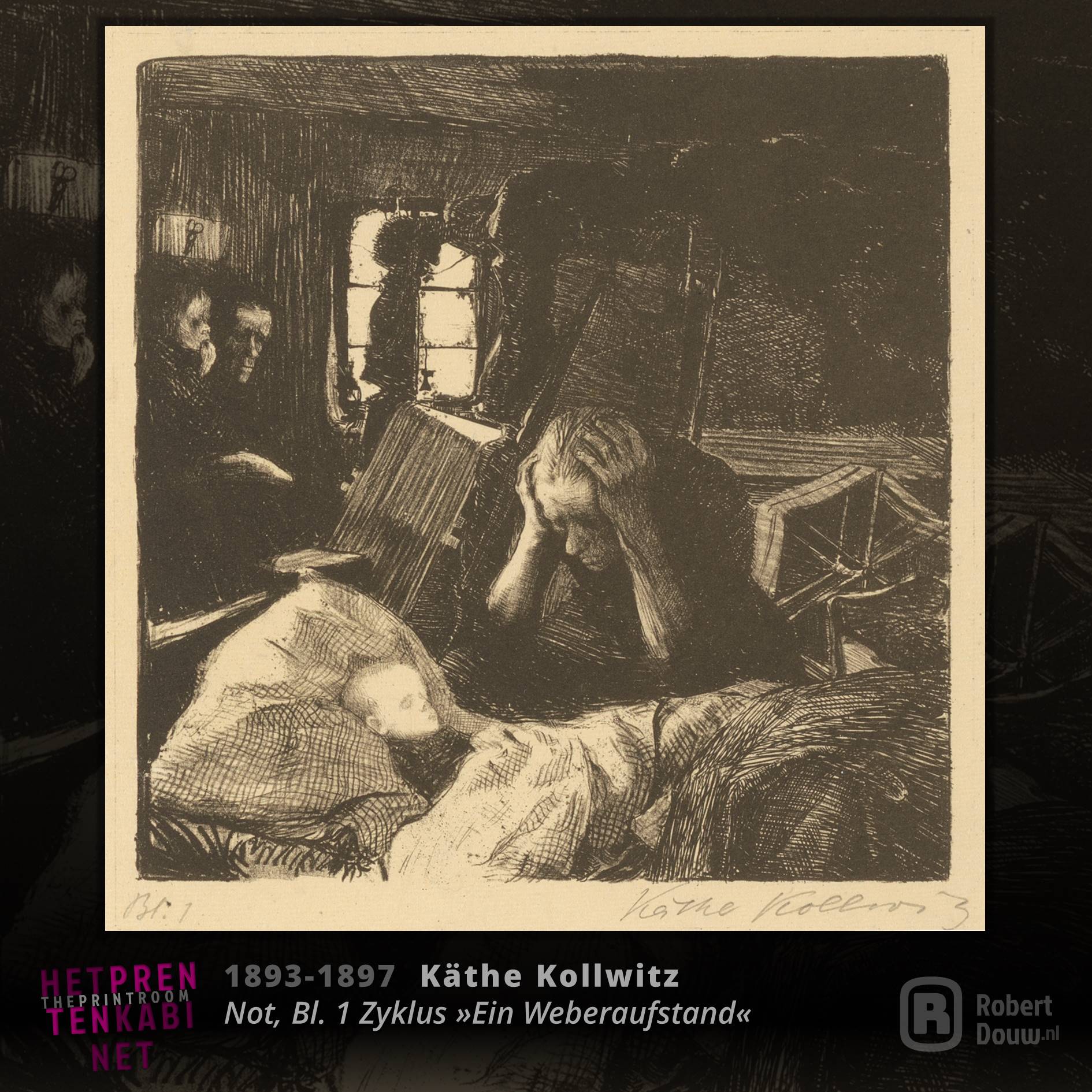
Swipe the image to view the full picture
Käthe Kollwitz often made quite dark work. By that I'm not referring to the black ink, but to the themes in her work: social injustice, war, death and loss. She managed to portray these themes so convincingly that my appreciation for her work varies somewhat depending on my mood. Sometimes it just hits me too hard, I think, which of course only underlines how good her work is. Kollwitz achieves this mainly through her very recognizable style, which I can hardly describe, but which fits perfectly with the rough sides of life. The above work (Need, page 1 from the cycle 'A weavers’ revolt', 1893-1897, crayon and pen lithograph) shows the great need of starving weaver families. A distressing image, that says more than words can express.
Artist on Wikipedia: Käthe Kollwitz
Image source: Käthe Kollwitz Museum Köln
Museums: Käthe Kollwitz Museum Köln, Käthe-Kollwitz-Museum Berlin
TO TOP
Katja Lang
1968
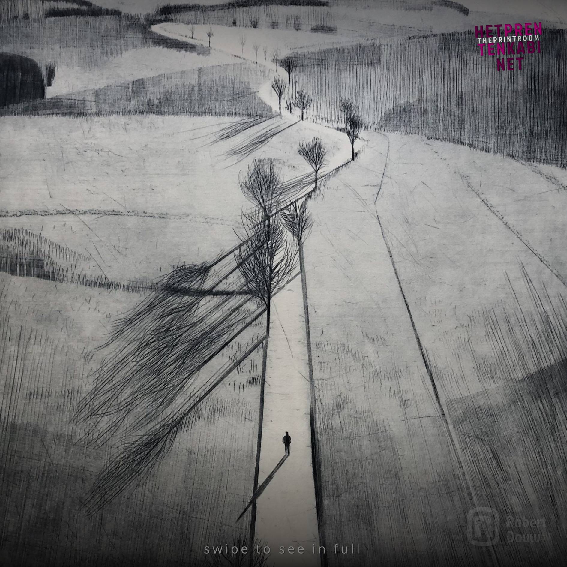
Swipe the image to view the full picture
A lone figure - no more than a silhouette - in an immense landscape; that's what I see before me when I read the name Katja Lang. I've been following her on Instagram for a while now and have come to really appreciate her work. The landscapes are beautiful, in all their relative simplicity. You can see the scratches of the needle, which match the unpolishedness of the wild nature. The figure gives the landscape scale and thus shows its vastness. It shows how impressively beautiful the natural world around us is, and how man is puny in it in a positive way. I really like vast open areas where you can see as far as the horizon and in Katja Lang's work I feel the wind in my face, as it were. In addition to her image, Lang often refers to a quote from literature. In Straße nach E. (2022, drypoint, 67 x 50 cm) it is a haiku by Getto, translated "The dream of spring / Is just a fleeting song / From my heart".
Artist's website: katja-lang.com
Artist's Instagram: @_katja_lang_
Iamge source: katja-lang.com
TO TOP
Jan Mankes
August 15, 1889 - April 23, 1920
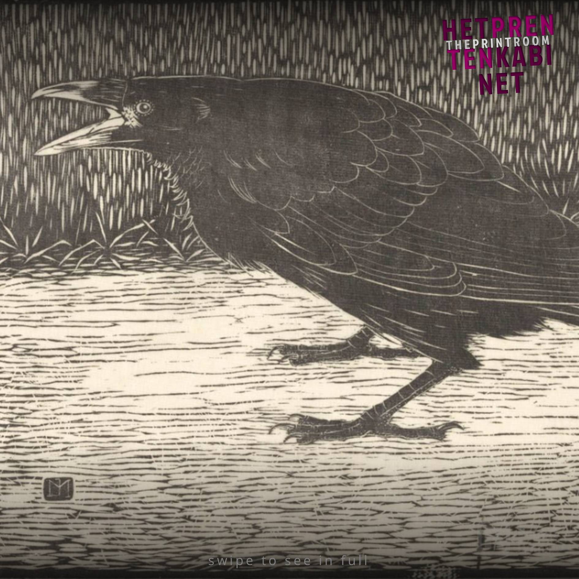
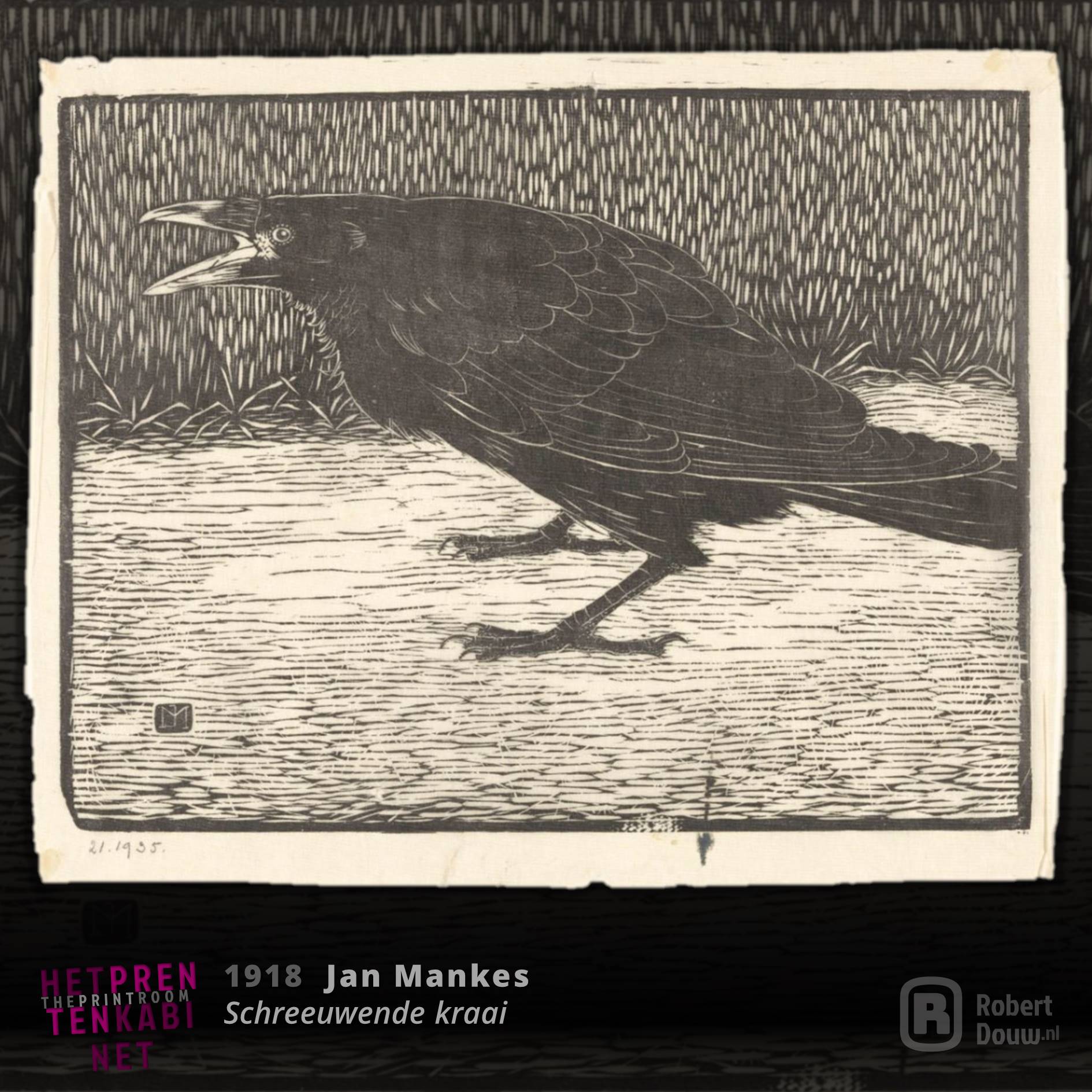
Swipe the image to view the full picture
Ever since Jan Mankes was called 'Holland’s most tranquil painter' in 1923, his work has been called only "tranquil" almost everywhere. With that you are selling the work and the maker short, in my opinion. In a fairly short period – he died at the age of 31 – Mankes created an oeuvre in which each work unmistakably bears his signature. In his paintings you can see that in his paint treatment and use of colour. In all his work - paintings, prints and drawings - in his use of lines. Some of his works, such as the one above (Screaming Crow, 1918, woodcut (2nd state), 18.3 x 23.8 cm), are very powerful. In the first state the bottom is still scratchy and grey, but in this second state Mankes has also worked with a strongly accentuated stripe pattern. This balances the whole and creates a stronger contrast. This work does not express tranquillity, but awe.
Artist on Wikipedia: Jan Mankes
Image source: Rijksmuseum Amsterdam
Museums: Museum MORE and Museum Arnhem
TO TOP
Edvard Munch
December 12, 1863 - January 23, 1944
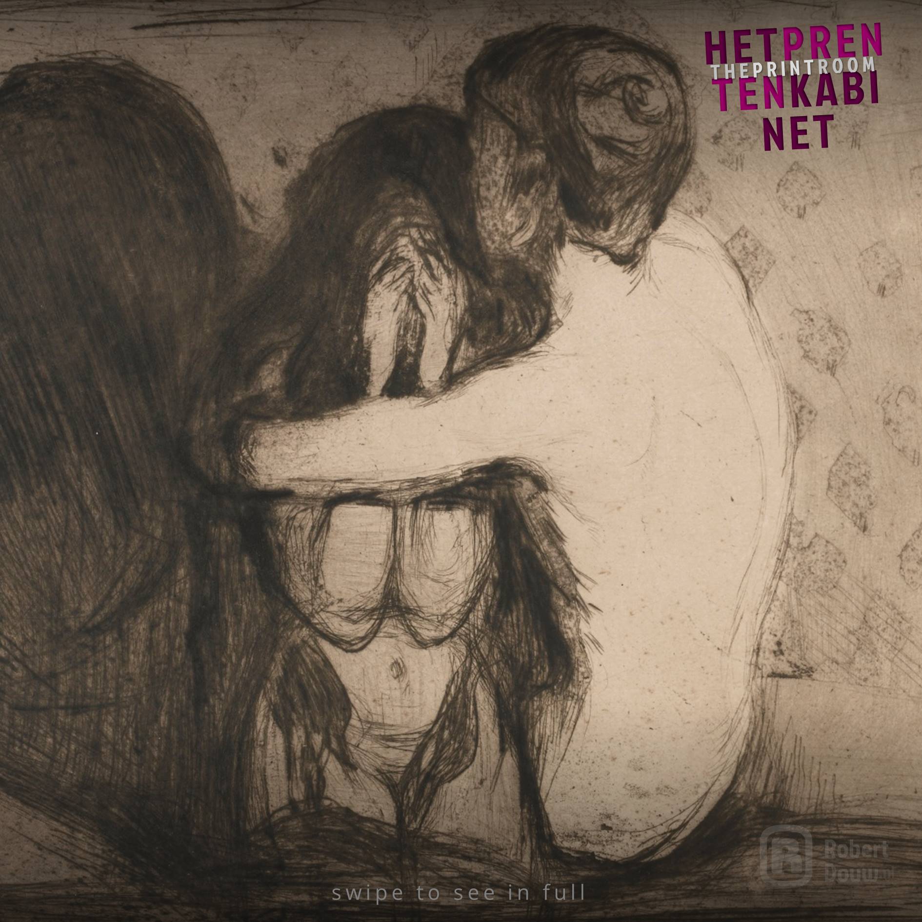
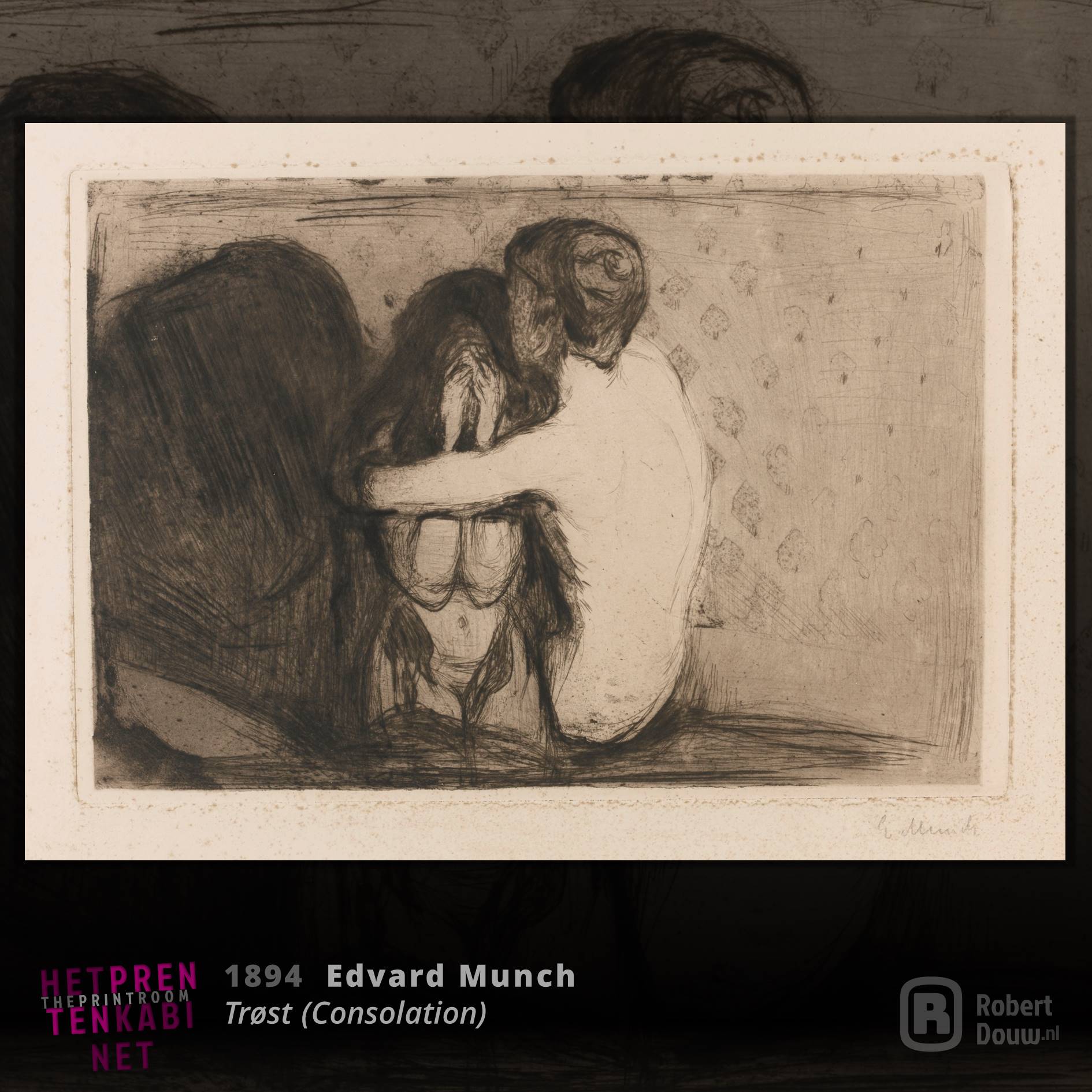
Swipe the image to view the full picture
Edvard Munch is probably less known to the general public by name than for his masterpiece The Scream, arguably the most expressive expression of fear and despair in painting. The fact that Munch can also very aptly depict other emotions and that he also masters techniques other than painting is undeniable from the above work (Trøst (Consolation), 1894, drypoint and etching in black on cream wove paper) [state 5 of 6], 20.6 × 31.1 cm). The longer I look at it, the more impressive I find it: the poses of the figures, the direction of the light, the composition: it all adds to the intensity of the image. The sadness of the figure on the left touches your soul. The first thing your eye goes to, though, is the strongly contrasting comforting arm of the right figure. The world should have less screams and more consolation.
Artist on Wikipedia: Edvard Munch
Image source: Wikimedia Commons
Museums: Munchmuseet and Art Institute Chicago
TO TOP
Camille Pozzo di Borgo
1994
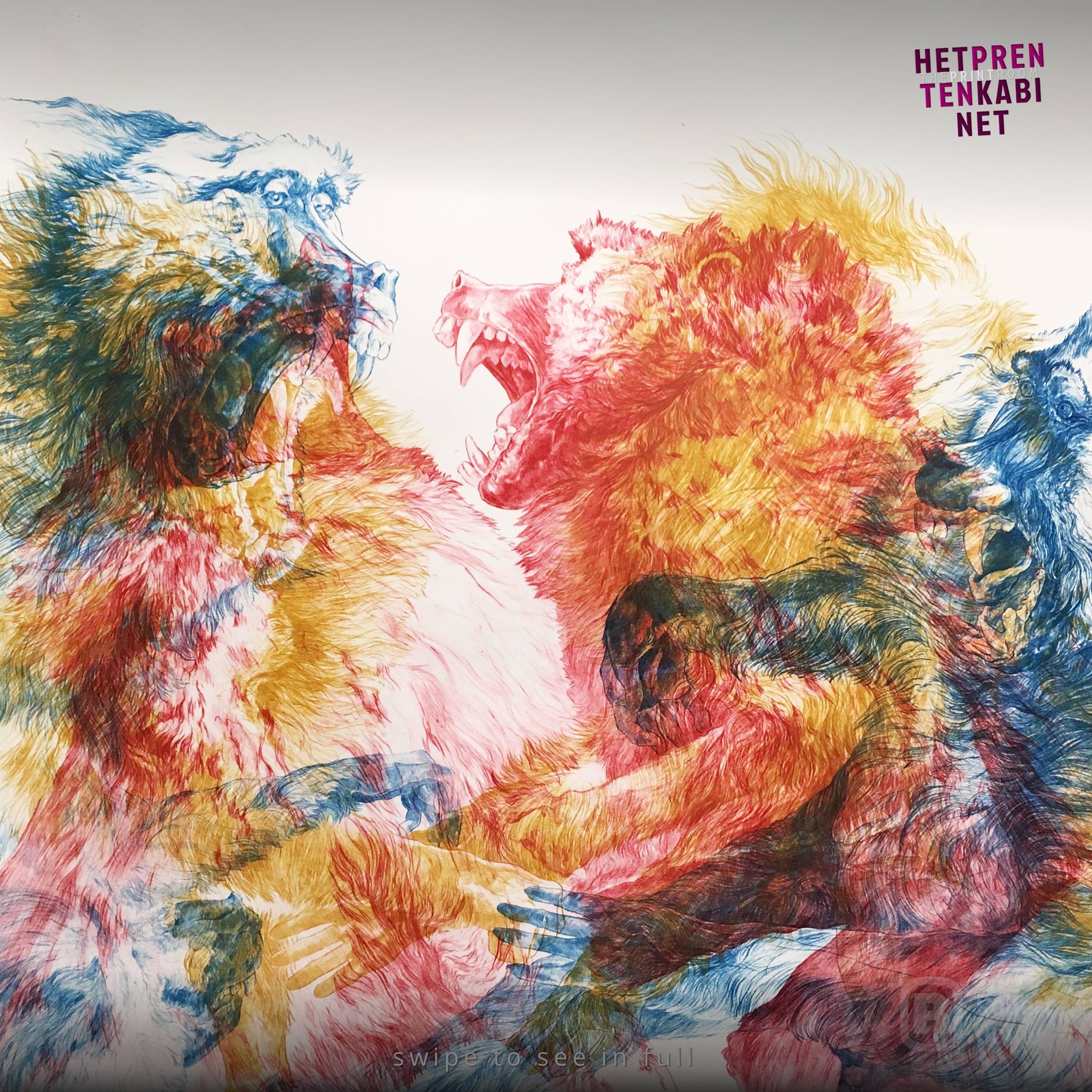
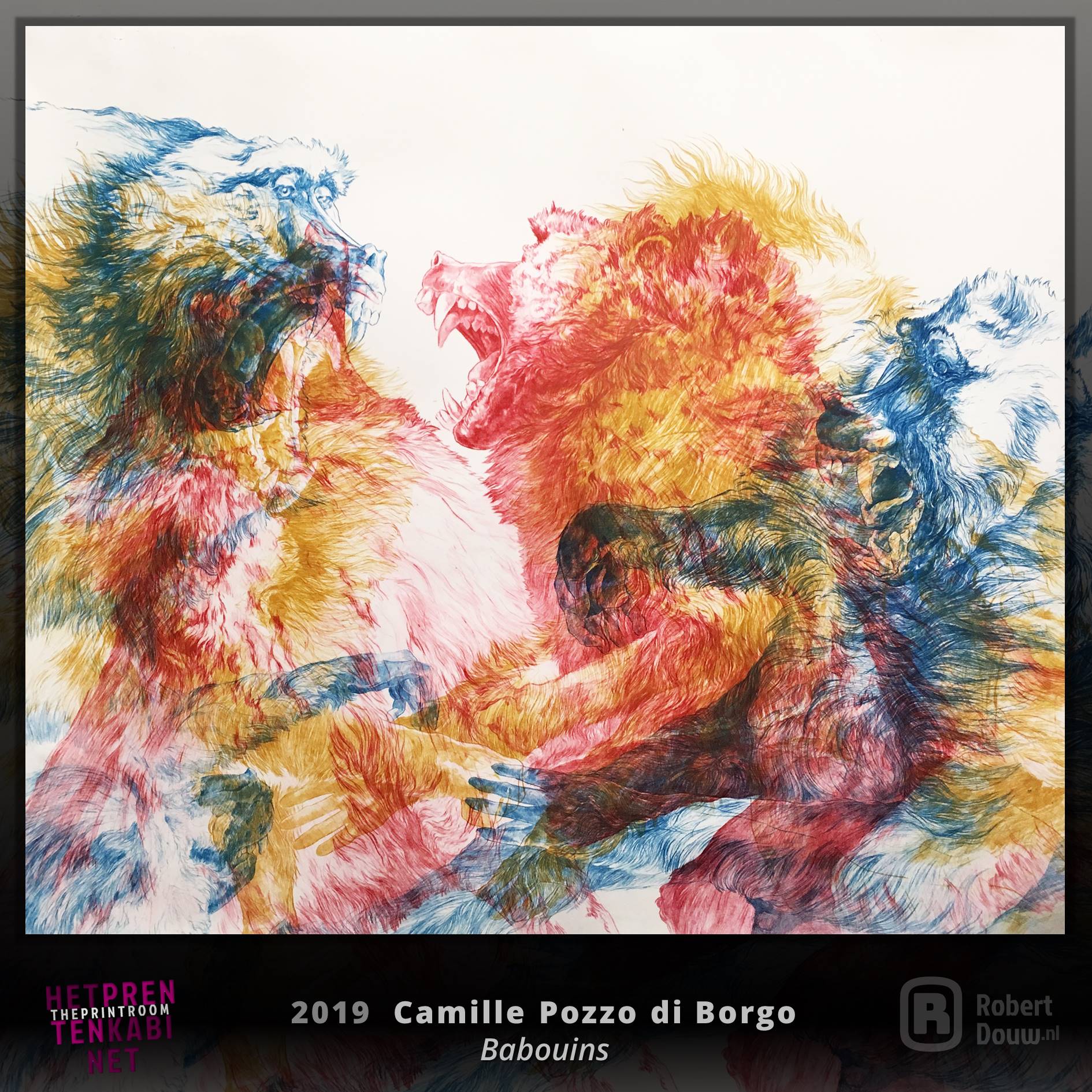
Swipe the image to view the full picture
Camille Pozzo di Borgo is a Corsican artist living and working in Paris. She specializes in depicting animals, using different printing techniques. She often prints several animal figures on top of each other or mixed up, resulting in very dynamic images. As far as I'm concerned, that effect is strongest in the prints with colours that differ a lot from each other, such as on the above version of Babouins (January - February 2019, etching: drypoint on plexiglass printed on paper in three passages, 140 x 120cm). By printing the baboons in different colours, you seem to be in the middle of the action of a fight. If you scroll or swipe through her Instagram page, you'll see that she does more than just depict the animals; each print comes across as an investigation into behaviour, facial expressions and attitudes. Printmaking is a beautiful thing, especially in such skilled hands.
Artist's website: camille-pozzodiborgo.com
Artist's Instagram: @camillepozzodiborgo
Image source: cargocollective.com
TO TOP
Rembrandt van Rijn
July 15, 1606 - October 4, 1669
Swipe the image to view the full picture
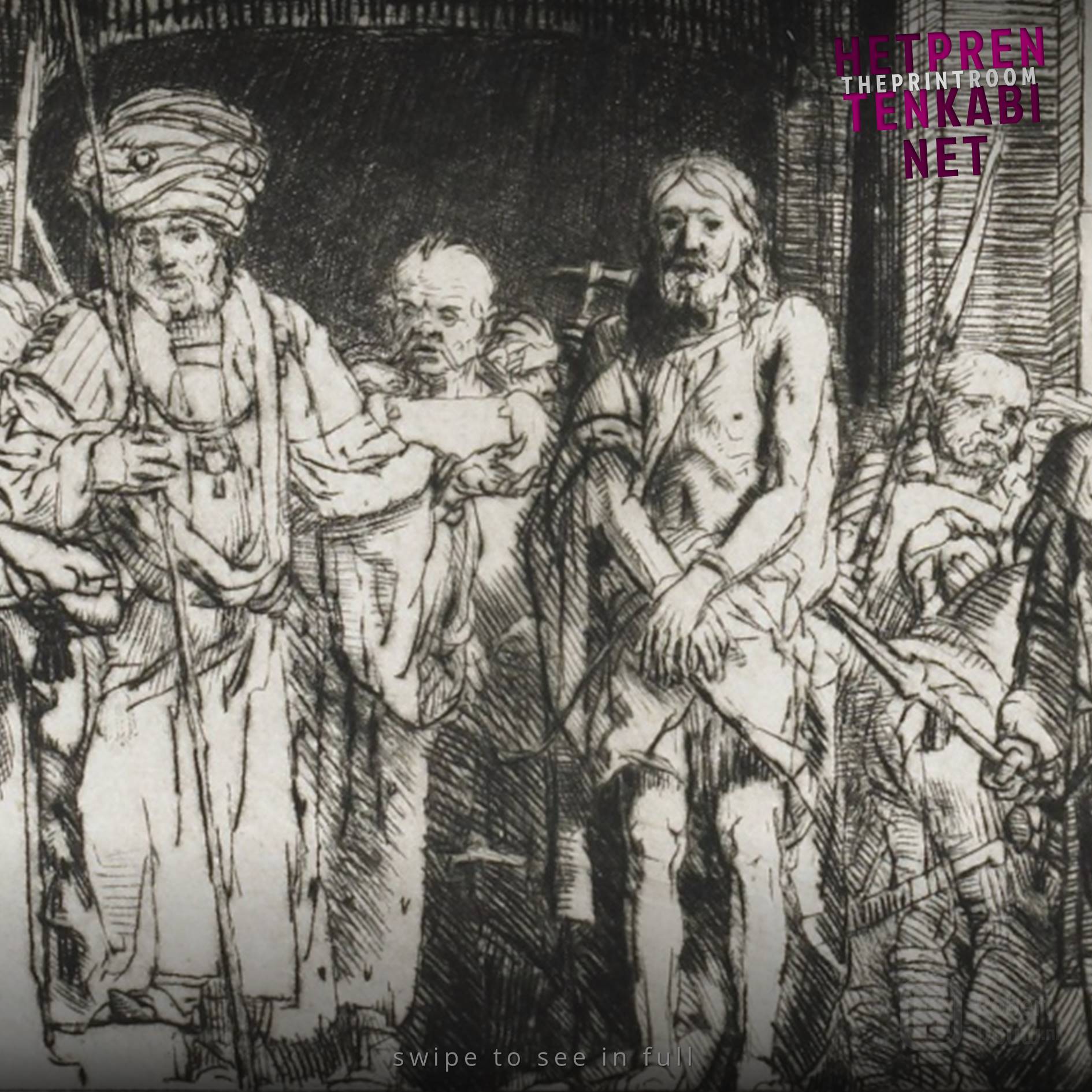
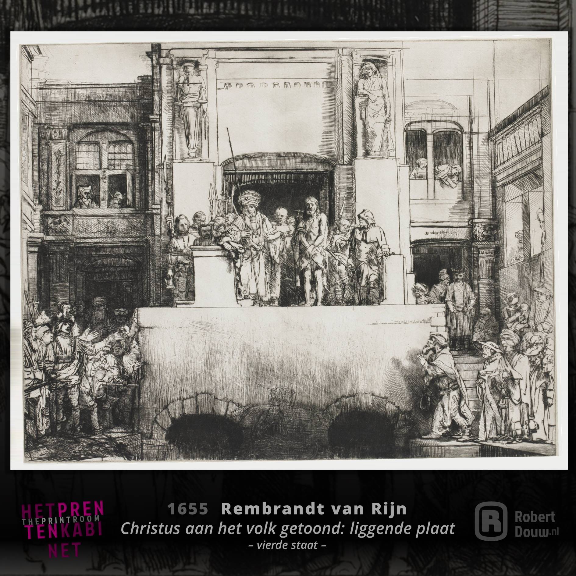
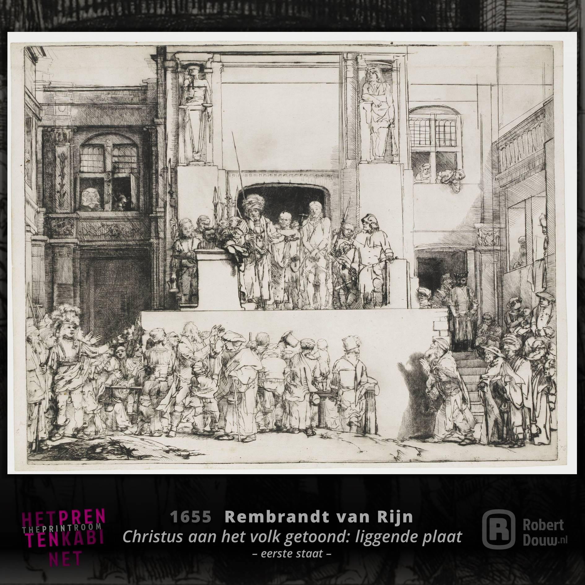
In addition to an impressive oeuvre of paintings and drawings, Rembrandt van Rijn made an enormous amount of etchings, in which he was probably self-taught and in which he continuously renewed himself in a progressive way. The detail above comes from the fourth state of Christ presented to the people: oblong plate (1655, drypoint [state 4 of 4], 38.3 x 45.5 cm), which you can see completely in the second image. If you compare this with the first state (3rd image), it almost seems as if Rembrandt has started again on a different plate, but from the window at the top right you can clearly see that it is indeed the same plate. Rembrandt used the inevitable wear and tear of the plate from printing as an opportunity to improve his composition, which was already special for this scene. That's rethinking like a true master.
Artist on Wikipedia: Rembrandt
Image source: Rijksstudio (image 1 and 2) and Rijksstudio (image 3)
Museum: Rijksmuseum, Amsterdam
TO TOP
Anders Zorn
February 18, 1860 - August 22, 1920
Swipe the image to view the full picture
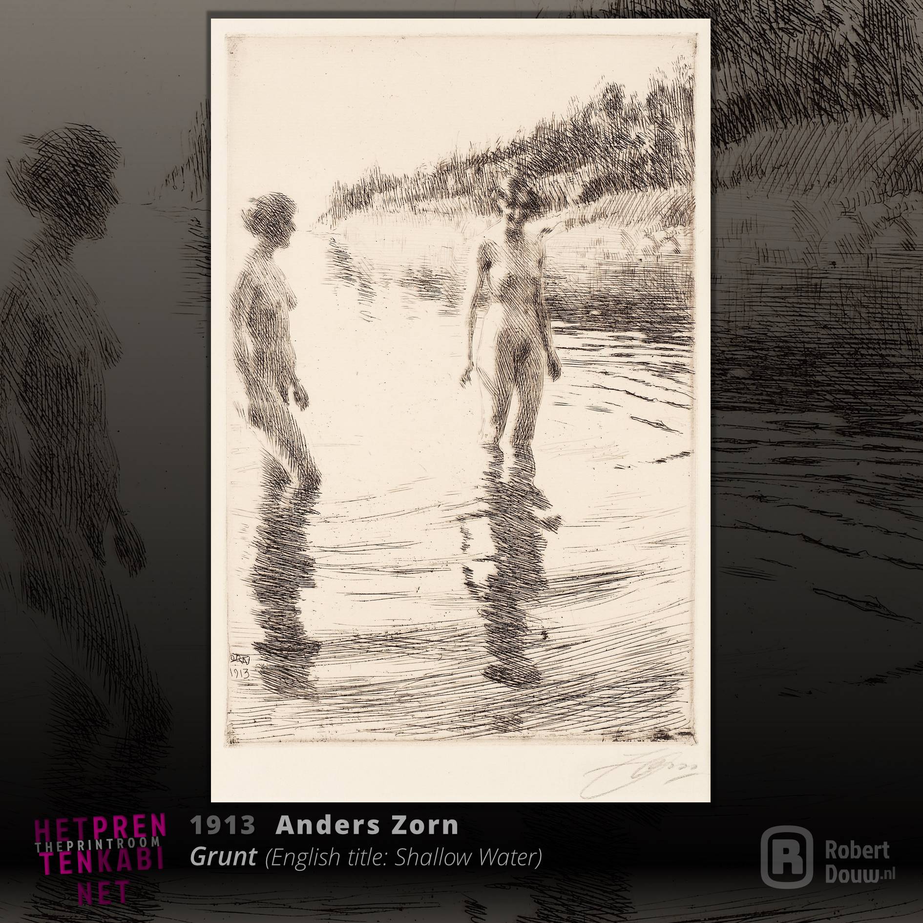
Anders Zorn became known as a painter, but already before he switched from watercolour to oil paint, he made his first etching. Fortunately, many more would follow. He did use a very loose touch in his (later) paintings, but worked even more loosely in many of his etchings. Look at the work above (Grunt, 1913, etching (state IV of IV), 29.8 x 19.7 cm), for example. If you look at a detail up close, it is almost indistinguishable what all those loose lines represent. But when you come up to the work from a distance, as I did at the Kunstmuseum Den Haag, you first think it's a black and white photo. Zorn mastered the art of depicting just enough to make a convincing suggestion. The mind of the viewer further completes the image.
Artist on Wikipedia: Anders Zorn
Image source: Bukowskis
Museum: Zornmuseet
TO TOP
Henry James
John Singer Sargent
Lake Keitele
Akseli Gallen-Kallela
VISUAL ARTS
Click here for an overview of everything in the Visual Arts section.